
On the Radar
Tracking the Elusive Bigfoot in Massachusetts
Data visualization | print | data story

WHAT I DID & LEARNT:
Overview
Data Visualizer, Graphic Design
Deatils
Book Layouts, Cover Pages, Conceptual development, Data storytelling, Print Design,
Typography, Visualizations, Data Analysis
Duration: 4 Weeks (Academic Project)
Toolkit: Adobe XD, Figma, Illustrator, Photoshop
Type: Data Visualization Project
Will Justice be
served?
A brief history into police violence in the United States
This book analyses police violence in the United States of America by accumulating data from various sources. It concentrates on the aspect of conviction of a felony and looks at a series of data visualizations and analyses to support the statement.
To balance the grievance of the topic and universal appeal, a monochromatic cover and a warm yet minimal color scheme with solid visual graphics and typography fit in the asymmetrical layout elements.
GOAL
Imagine an enhanced podcast experience that not only meets the
basic needs of users, but also adds additional value to their listening.
The people who listen to Spotify Podcasts.
Market Research: Uncovering the competition

Two unique personas created for the project
The Dataset
The above dataset on avocado prices is sourced from Mapping Police Violence.
This dataset scans data for name of the people. The demographics in the table reflects a per name information, date, and location.
This dataset was later analyzed using R studio to get the desired information.
Key questions after looking at the dataset:
How to stop police brutality?
Which age groups are targeted?
Does racism play an important role in the number of killings?
Would change in rules help?
Has anything changed since theBlack Life Matters movement?


"Tracking the sightings of the Bigfoot
Identifying Cognitive Tasks"
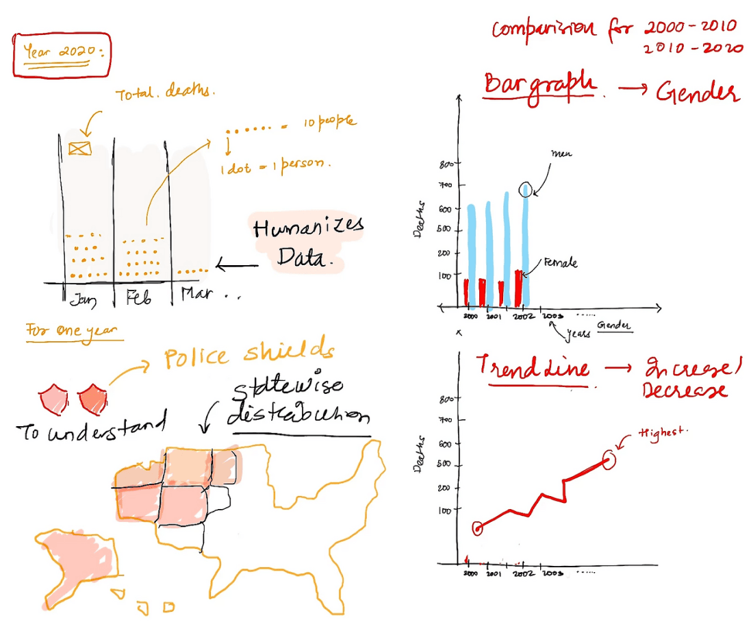
Design Decisions:
Decoding the design process:
Marks
Channels
On the Radar
Tracking the Elusive Bigfoot
in Massachusetts
Project By: Purti Hardikar
Bigfoot Sightings in Massachusetts (1977-2020)
1
2
3
4
1. Locate the visualization: The visualization or chart that displays the data for each sighting that have been reported on the page (scroll down)
2. Find the legend or key for the chart that clearly indicates the meaning of each symbol, with the brown circle labeled as "woods."
3. Find the fall quadrant from the chart
3. Then find the color-coded circles, in the chart where the brown circles represent sightings in the woods.
4. Count the number of circles to find the number of sightings in the woods.
(if you want to know more >
you look at the size which corresponds to the number of witnesses)
Cognitive Tasks:
01: What is the season with the highest number of Bigfoot sightings?
02: Recalling the number of times people saw Bigfoot in the woods in fall.
03: Determine the total count of Bigfoot sightings that fall under the A class.
03: Recalling the number of people who witnessed the Bigfoot sightings.
04:Analyze the data to determine if there is a specific type of environment that has a higher frequency of Bigfoot sightings.
Each circle showcases 1 sighting and the size of the circle denotes the number of witnesses that each sighting had.
Position: the location of a data point on the chart = Location of the county
Area/ Size: the size of a the circle
= No. Of Witnesses
Color: the color or shade of the circle
= Environment Spotted in
Shape: the circle/bubble to represent a data point
= Number of Sightings
Visual Queries for Task 02:
How would one find the reported sightings in the woods in fall?
Visual Cognition | ARTG5310 37500
Marks Used:
Data Object : Bigfoot sightings in Massachusetts
Channels Used
1
2
3
5
The chart groups data points into 4 quadrants using horizontal and vertical lines and angular lines at the chart's center.
(Here representing seasons)
Quadrant - Lines
Marks in a quadrant bubble chart are Circles or data points
(here Bigfoot sightings) representing specific combinations of two variables, with the mark size representing a third variable.
Circles

Fall
C
B
A
Winter
Spring
Barnstable
Berkshire
Bristol
Essex
Franklin
Hampden
Plymouth
Worcester
Barnstable
Berkshire
Bristol
Essex
Franklin
Hampshire
Plymouth
Worcester
Barnstable
Berkshire
Bristol
Essex
Franklin
Hampshire
Plymouth
Worcester
Barnstable
Berkshire
Bristol
Essex
Franklin
Hampden
Plymouth
Worcester

Summer
How to read it:
Environment:
Woods
Mountains
Swamp
Lake
Snow
Field
No. of witnesses:
1
2
3
5
Circles = Each sighting recorded
Circle Size = No. of witnesses
Circle Color = Environment
Circle Placement = Class
On the Radar
Tracking the Elusive Bigfoot
in Massachusetts
Counties
Counties
Counties
Understanding the dataset:
Inspiration:
I initially reviewed the variables to identify their data type, such as numerical, categorical, or nominal. This allowed me to gain insight into how I could effectively visualize the data.
I was inspired to create a unique data visualization by combining two different types of charts, specifically a radar chart and a circle quadrant chart. The resulting design provides an innovative and effective way to visualize my data.
Tunability:
I carried out exhaustive market analysis
on the existing podcast platforms to
grasp capabilities.
R 34
G 32
B 35
R 232
G 272
B 214
R 195
G 53
B 53
R 255
G 173
B 51
R 255
G 228
B 296
R 225
G 105
B 67
All the visualizations has the following colors palate which is a mixture of light bright tones and ark tones, showing the two sides to the police brutality, one being harsh and dark, and one being innocent and warm. The bright colors set a proper contrast.
SKETCHING
I needed to display the data and observations from the given datasets and a few extra, which I pulled from a few websites. To understand how to display the data, I sketched the visualizations before turning them into graphics.


Immerse yourself
in podcasts.
a better musical experience.
a better musical experience
Podcast Listeners
FOR EVERYONE

New. Improved.
REDESIGN
PROBLEM 01:
Return to last episode:
USER SCENARIO
SOLUTION
Introducing a 'Continue Listening' feature to address the challenge of active listening for extended periods of time, as podcasts can be lengthy
If a user returns to their liked podcast channel after listening to only part of an episode, they may have difficulty locating that specific episode as it may not appear at the top of the list. Instead, they would need to scroll through all of the episodes to find the one they were listening to previously.
Streamlined User Management Pop-Up for Efficient Role Modification

PROBLEM 02:
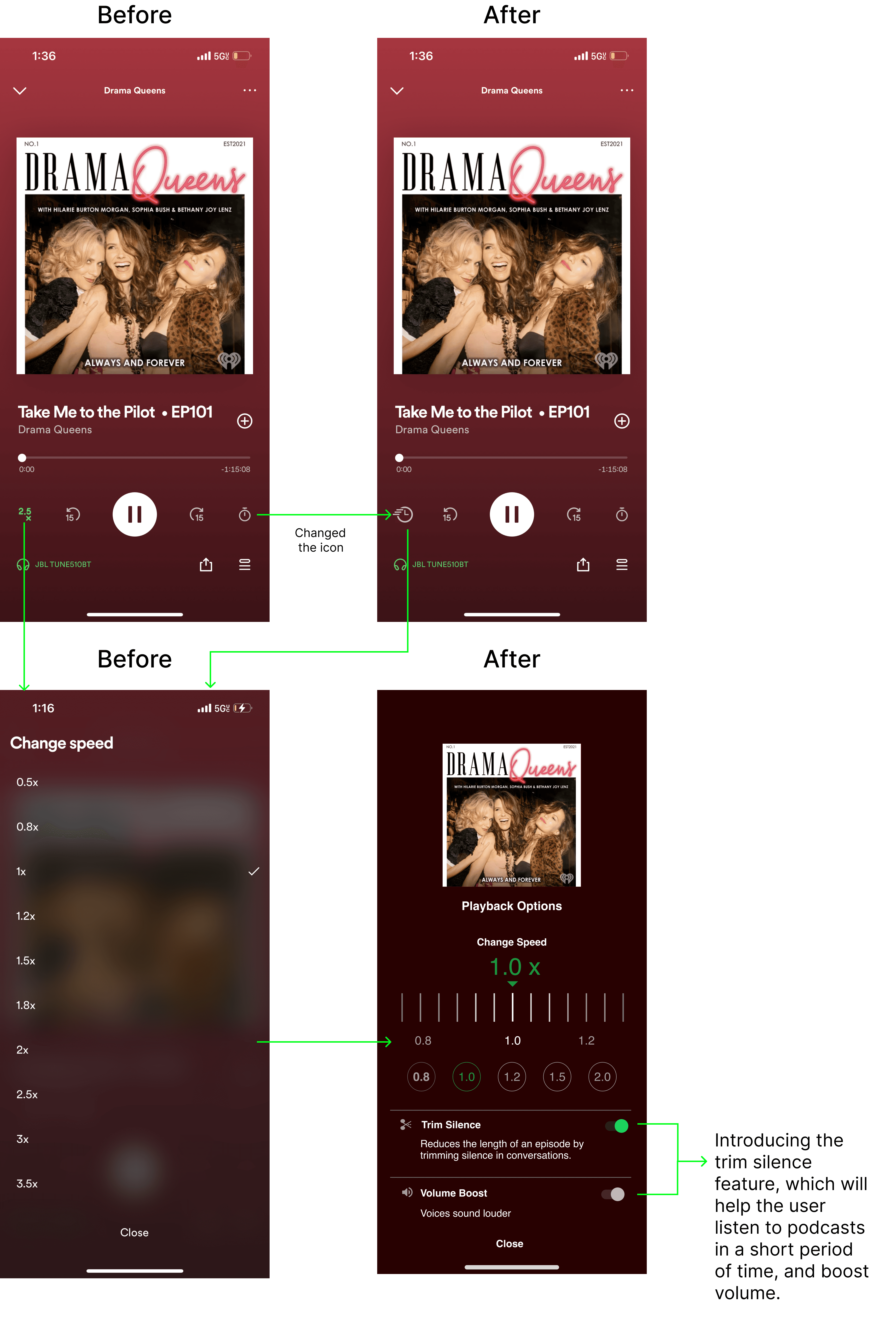
Trim Silence + Voice Boost
USER SCENARIO
SOLUTION
We propose the inclusion of new options for customizing the audio experience of podcasts on Spotify without occupying additional space on the screen.
To achieve this, we suggest changing the icon for the current 1x speed, indicating the presence of additional options.
Upon clicking this icon, users would access the current features while also being able to take advantage of the new options of trimming silence and enhancing audio quality.
The current level of customization options for audio experience while listening to podcasts on Spotify may be limited. Beyond adjusting playback speed and setting a sleep timer, users may find themselves wanting additional features to tailor their listening experience to their preferences.
Streamlined User Management Pop-Up for Efficient Role Modification
PROBLEM 03:
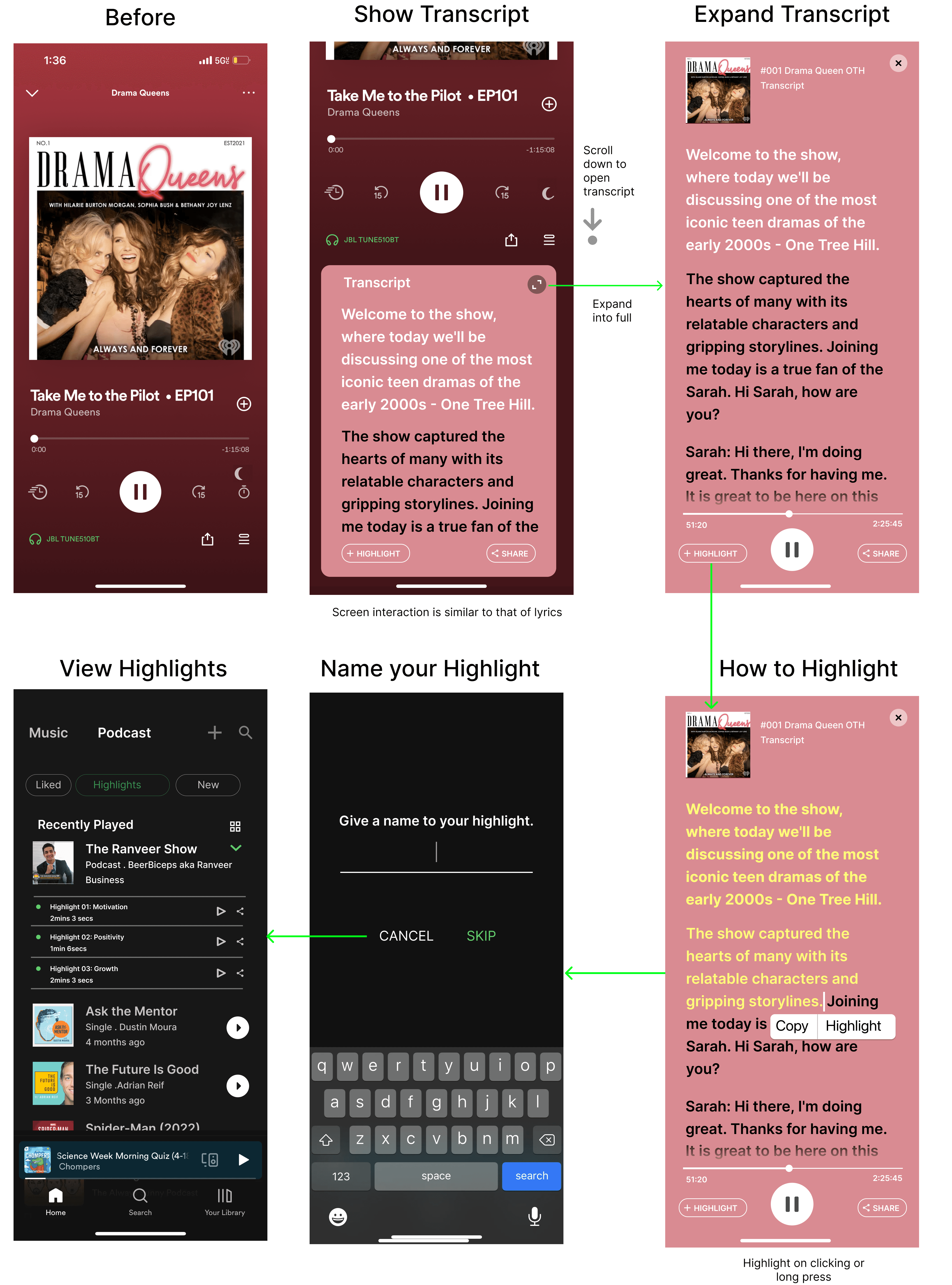
Taking Notes:
USER SCENARIO
SOLUTION
Adding a highlight button to the podcast listening experience on Spotify. Upon clicking, users could select and save portions of the transcript as noteworthy highlights. The feature would allow users to easily keep track of important information from the podcast for future reference.
While transcripts are currently available to users, podcasts are a platform that often necessitates note-taking for important points such as links or examples.
As someone who has personally encountered this challenge, it can be tempting to make such notes for reference later on.
Streamlined User Management Pop-Up for Efficient Role Modification
I learnt how to work on InDesign, typography and visual elements and how to divide them using graphic design principles.
I heavily relied on John Kane’s: A type premier to understand type and layouts.
I watched the movie Helvetica and how fonts and typography is super important beyond print piece and in real world.
This book was my first exploration with graphic design.
“A system cannot fail those it was never built to protect."
- Vann Newkirk


