Coveisve Design System
A Comprehensive Design System Launched for the cove. Tool Suite of Products
Team
Toolkit
Nov 2023 - Present
Maturirty
Purti Hardikar: UX DesignerKhoury Smith : Front-End DevParva Doshi: Back-End DevPatrick Chopson: CPO
Adobe XD
Figma
Zeroheight
My Role
Designer —
Audit interfaces, define elements, design components, create pattern libraries, track versions, incorporate feedback, maintain the design system, stay updated.
Timeline & Status

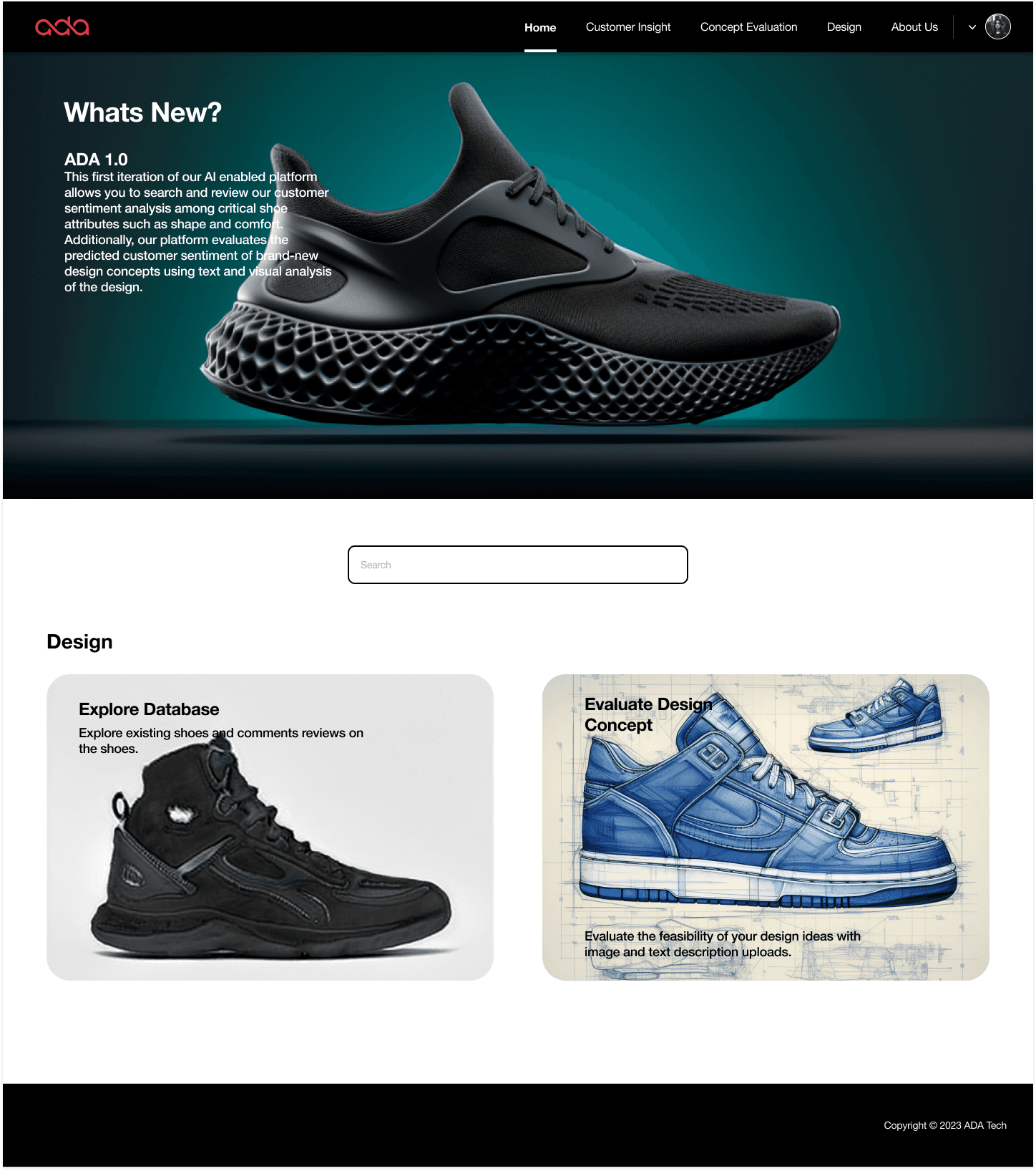
Cove.tool, a platform for sustainable building design, empowers professionals to make data-driven decisions.
To address challenges in consistency and user experience, we developed Covesive, a comprehensive design system designed to improve accessibility, streamline workflows, and ensure a cohesive experience across the platform.
Design & Implement
I worked alongside a small team to audit cove.tools existing design, define principles, build scalable components, and document it.
CONTEXT
How we gave cove.tool it’s …. "First design system
My Role
Document & Maintain
I maintained and documented the design system, publishing it on ZeroHeight to ensure seamless developer handoff and adaptability.


Before
Inconsistent styling, such as mismatched radii, inefficient
layouts, and misaligned typography, resulted in increased
user friction and the platform's scalability.

After
Consistent styling aligned with the rebranded design
language improved visual cohesion, and efficiency, resulting
in better usability and reduced development rework.
The design system is still a work in progress. My contributions focused on rebranding and establishing foundational elements, including an enhanced color palette, typography, grid system, and scalable modal components.
We discovered inconsisitencies in all our tools, which impacted both usability and efficiency.
How can I create a design system that is simple, scalable and understandable
by designers and developers?

Strating from what we had..
PROCESS
Building a design system from scratch was something that I had never worked on as a UX designer. However, I took it up as a challenge and with the correct mentorship, I was able to deliver a system that we can all rely on for feature updates in our product.
I obviously started by looking for resources and took a few courses before
I started planning this maturity model:


We are here
👇🏻
Phase 2
🤔
Where we want to be🎯
steep..
Maturity..
Process we followed to create the design system, inspired by the approach at mapbox.com.
A digital home for our brand guidelines, designed as a highly functional resource for our designers and developers create consistent, efficient user experience and products.
WHAT WE WANTED TO CREATE?
Learning the basics of a design system
RESEARCH
I wish I were born with the superpower to create design systems!! 👽
While I did have experience adhering to a design system/style guide before, I had never previously created one myself from scratch.
This meant learning from the popular publicly available design systems like that of HIG, Apple, Material design, IBM Carbon, Intuit, etc.
Furthermore, Incorporating Atomic Design principles really helped me step up my game. Just like matter, we can hierarchically organize components in a design system into various levels depending on their construction and complexity.

The different levels of atomic design principles applied in design systems by Rohan Kamath.


Material Design
IBM
iOS Design
I did a quick site audit
Many of the pains I encountered designing cove.tools new features and platform was knowing how to address the inconsistency between my designs and the live application.
Could it be that the developers were working with different assets?
To validate my suspicions, I did a quick site audit. I discovered that not only were the assets widely different, there were so many variants of buttons, badges, and other components.
DISCOVERY + SITE AUDIT
Low Priority Changes
Medium Priority Changes
High Priority Changes


Documented fixes using screenshots and thorough inspection.
The problem? Too many variants!
We compiled a comprehensive report outlining how we identified and documented various visual inconsistencies across the site. The audit was reviewed by multiple team members to ensure it offers accurate insights and feasible recommendations.
By analyzing the audit and prioritizing design system fixes, we clarified the overall problem space.
You can access the full site audit at the link here >
SITE AUDIT
So how will a design system help?
Looking back at the original problem at hand –I knew I had to create a design system that would be easy for both designers and developers to use and understand.
After all, the needs of the developers were just as crucial as the designers'.

I pitched our design system to our stakeholders and the software team to showcase how a design system will benefit the team & the company.
We made a potential impact report of the design system
on different teams and how it will improve their workflow:
Click on the tabs to gain insights 👇🏻
Building Cove's Design DNA
Data-Driven Precision
The design system prioritizes data-driven decisions, clarity, and usability to simplify complex data.
Simplicity and clarity
The design system embodies simplicity, efficiency, and minimalism, supporting sustainability through thoughtful design.
Inclusive Transparency
The design system ensures accessibility, inclusivity, and transparency, fostering trust and usability.
I further defined the qualities that can be expressed by UI regions, surfaces, and components in our design system.
I designed and strategize how our suite of tools is built using foundations that address design from both a broad and detailed perspective.
Constructing the System
Building on insights from multiple references, we decided to adopt an Atomic Design approach. By breaking components into manageable, bite-sized pieces, we established a more holistic design strategy.
Despite potential roadblocks, this methodology laid a solid foundation for our design system.
ATOMS, MOLECULES, ORGANISMS & TEMPLATES
👀 Here is a quick peak of how I organized the components using atomic design principles
Atoms
Icons
Checkboxes
Buttons
Badges
Tags
Templates
Icons
Checkboxes
Buttons
Tags
Molecules
Icons
Checkboxes
Buttons
Tags
Organisms
Icons
Checkboxes
Buttons
Tags
Button
Button
Tag
Consulting
Tag
ai powered

Constructing the System
Building on insights from multiple references, we decided to adopt an Atomic Design approach. By breaking components into manageable, bite-sized pieces, we established a more holistic design strategy.
Despite potential roadblocks, this methodology laid a solid foundation for our design system.
ATOMS, MOLECULES, ORGANISMS & TEMPLATES
BASE ELEMENTS
Color
LATO is the font that was usedin our software and the marketing team had been using it in thier presnetations, this font was chosen for it's clean, moderm and hihgly relaible design aligning withthe cove.tools docus on trust and smimplicity.
Color
LATO is the font that was usedin our software and the marketing team had been using it in thier presnetations, this font was chosen for it's clean, moderm and hihgly relaible design aligning withthe cove.tools docus on trust and smimplicity.
Icon, Radii & Strokes
LATO is the font that was usedin our software and the marketing team had been using it in thier presnetations, this font was chosen for it's clean, moderm and hihgly relaible design aligning withthe cove.tools docus on trust and smimplicity.
Button States
LATO is the font that was usedin our software and the marketing team had been using it in thier presnetations, this font was chosen for it's clean, moderm and hihgly relaible design aligning withthe cove.tools docus on trust and smimplicity.
Typography

Create Account


Total Visitors
8,261
3%
1,373 visitors today
Desktop (1440x1024)
268 visitors
Desktop (1280x832)
349 visitors
Analyze Performance
856
+5.89%

Jul
Aug
Sep
Oct
Nov
Analyze Performance
856
+5.89%
Jul
Aug
Sep
Oct
Nov
Analyze Performance
856
+5.89%
Jul
Aug
Sep
Oct
Nov

Typography
Inter was chosen for its
clean, modern,
and highly readable design
, aligning with
ZooEx's focus on trust and simplicity.

Color
The color palette reflects ZooEx’s core
values:
greens convey trust and growth,
neutrals enhance readability, and soft
yellows add freshness.

Button States
Building on the existing foundations, I
designed interface components,
button
states, and variants
for modals.

Icons, Radii and Strokes
I refined key design elements such as
icons, border radii, and strokes, tailoring
them to enhance clarity.

Input Fields
I designed input fields with
clear labels, consistency, and
spacing
.

Modal Overlays
I refined
modal backgrounds, including containers and
nested overlays.
Base Elements
Reusable Design Patterns

I created reusable design patterns by auditing existing designs and establishing guidelines for typography, spacing, and
behavior.
These patterns enhance usability, streamline workflows, and establish a cohesive foundation for scalable design
and development.

Desktop (1024 px)
I designed input fields with
clear labels, consistent spacing, and
accessible states
, to ensure cohesion across the modals.

Mobile (375 px)
Components were adapted for smaller screens,
with streamlined layouts and spacing to maintain
usability without overwhelming the interface.
Example
I created components and documented them for ease of use.
Accessibility baked into the process
Get Started
Learn More
Documentation
Get Started
Learn More
Phase 3: Execution
I worked closely with developers to ensure seamless handoff and accurate
implementation of components. Using tools like Figma,
I provided detailed
specifications for grid systems, spacing, and interactive states
, enabling
consistent application across the platform.
Getting into the details

The execution phase successfully established reusable components and
patterns for ZooEx’s design system.
As the system evolves, the next steps
will focus on comprehensive documentation to ensure seamless team
adoption and scalability
.
Testing
We conducted usability tests with
12 participants, including existing ZooEx
users and internal stakeholders
. The tests focused on validating modal
layouts, button interactions, and input field accessibility.
Enhanced User Experience
Users reported a smoother, more intuitive experience when interacting
with the redesigned components, reducing cognitive load and improving
task completion time.
Faster Developer Implementation
Streamlined the handoff process and ensured faster implementation by
reducing ambiguity.
Improved System Usability and Adoption
The iterative testing process improved the design system’s usability,
accessibility, and developer adoption, ensuring it met the needs of all
stakeholders.
Measurable Results
Transformative Impact &
Stakeholder Reception
We developed a comprehensive presentation to demonstrate the ROI of
implementing our design system, aligning key stakeholders by quantifying
both immediate gains and long-term strategic benefits.
Current Status
Implementation Phase
Development team is currently integrating the design system across all product touchpoints, with regular feedback loops established.
View the pitch deck
User Engagement
15-20%
Increase in engagement metrics
Our consistent and accessible design system significantly boosted time-on-site and retention rates, particularly among our target demographic segments.
Development Efficiency
40%
Faster implementation cycles
The standardized component library reduced development time, allowing teams to focus on solving user problems rather than rebuilding UI elements.
Stakeholder Satisfaction
92%
Positive feedback score
Cross-functional teams reported high satisfaction with the new design system, citing improved collaboration and consistent user experiences.
This was my first experience scaling and maintaining a design system,
and I learned a lot about consistency, pitching, scoping and cross team-collaboration.
Maintenance & Updates: Consistency Builds Trust
Scalability: The design system grows with your business needs, offering flexibility to scale services as you expand.
Consistency: You get consistent, high-quality updates across web design, branding, and marketing for a unified brand experience.
Iteratively Adapting to Changing Needs
Seamless Integration
The cove.tools design system showed that consistent UI components streamline development and build trust, with close developer collaboration ensuring practical solutions.
Complete Flexibility
Reusable components emphasized scalability for future demands. Iterative stakeholder feedback uncovered blind spots, enabling the system to adapt to real-world challenges and brand evolution.