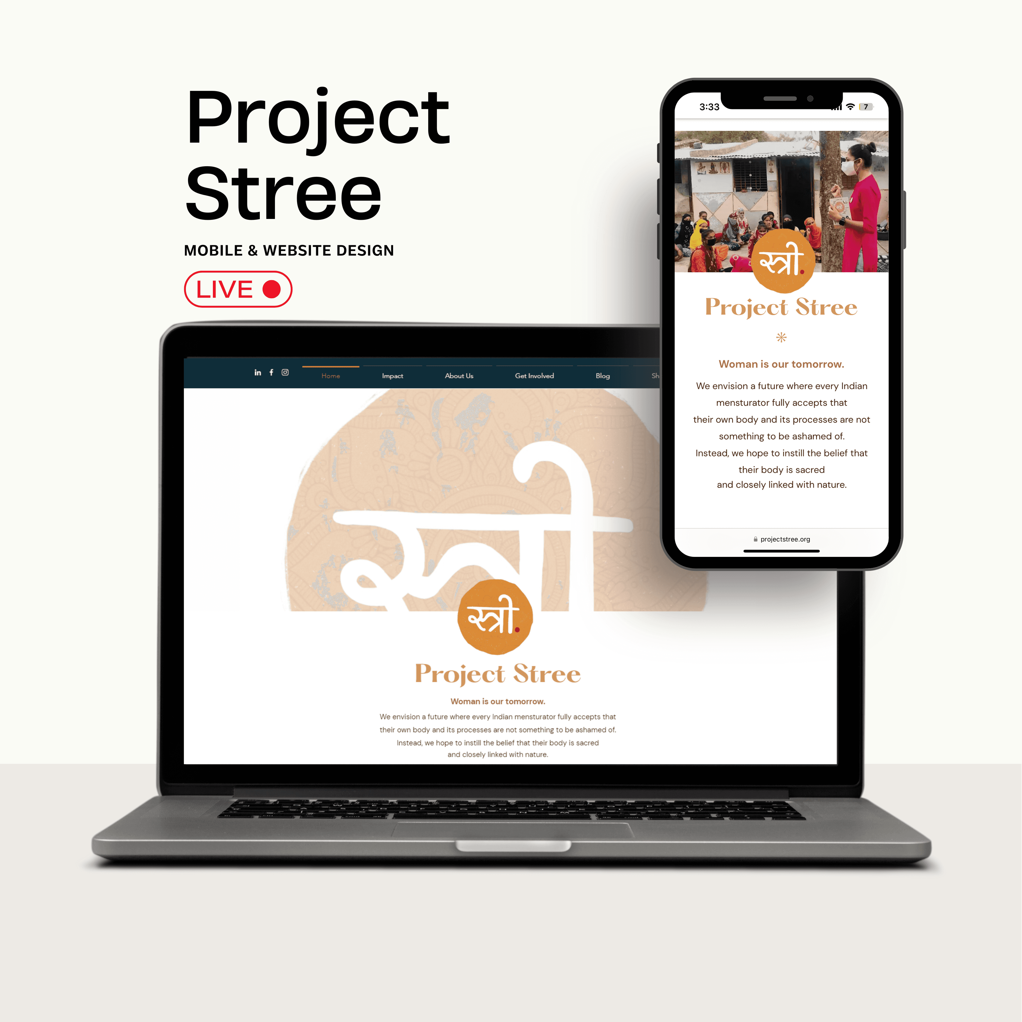
My Charlie App
Your Transit & Charlie Card Guide to Boston
MOBILE APP | Transit | proposal
My Charlie App
Transforming Boston's public transit challenges into a seamless digital experience.
Timeline
Team
Tools
Disciplines
Sep - Dec
2022
1 UX Designer
1 UX Researcher
2 Product Managers
Figma
Adobe XD
Balsamiq Wireframes
Figjam
Userberry
Mobile Application
Proposal
Public Transport
Problem Solving
Drawing from our collective experience as students in Boston, our team identified significant user friction within the MBTA’s physical ticketing system.
To tackle this we proposed the design of a mobile-first platform to digitize the MBTA Charlie Card. By synthesizing user pain points into a seamless digital interface, the team optimized the user journey, reducing physical touchpoint friction and enhancing overall transit accessibility.
USER PAIN POINT


Key Insight
This systemic failure point demonstrates how information opacity causes immediate service rejection and social anxiety for commuters
Imagine you’re sprinting for the 8:55 AM bus, already late for a final exam.
You feel helpless and embarrassed, forced off the bus as it pulls away without you.

This made us think?
Current Balance Management
How do users check
and reload their Charlie Funds
Card Management
What features & functionalities affect
the accessibility of Card?
Mobile App Integration
How can mobile app& payment
integration enhance experience?
Understanding user behaviors & pain points in managing card balances to optimize the reloading.
RESEARCH METHODOLOGY
User Interviews, Card Sorting, Journey Mapping
KEY METRICS
Success Rate : 94%
User Satisfaction: 4.2/5
Key Insights
85% of users prefer automatic reload
Mobile checking is primary method.
Balance anxiety is common pain point
KICK OFF & BREIF CREATION
We drafted a comprehensive list of research questions and used affinity mapping to shortlist the most relevant ones for our design. Our systematic approach ensured thorough coverage
of user needs.
LEAN & AGILE DESIGN PROCESS
Brief And Estimation
Design Team Process
Information Architecture & Wireframes
Feedback
Usability
Testing & Validation
Interaction & UI Design
Calendar Update
Satisfaction Survey
Final Delibarables
Discover
Validation
from Target Users
Kick- Off
Our team conducted a market audit of the MBTA using
SWOT and positioning mapping to decode existing inefficiencies and define strategic opportunities for a digital-first transit experience.
CONTEXTUAL RESEARCH
Decoding
MBTA

Boston's T operates both over and under ground, yet there aren't any Charlie Card Reloading kiosks at the overground stations.


The transportation infrastructure includes extensive routes and a broad grid, hence a significant populace relies on mass transit for their everyday jobs.

The transportation infrastructure includes extensive routes and a broad grid, hence a significant populace relies on mass transit for their everyday jobs.
The kiosks are solely accessible at the subway stations that are quite distant from one another, hence numerous individuals don't bother to pay for the journey or fail to catch their ride.
The transportation infrastructure includes extensive routes and a broad grid, hence a significant populace relies on mass transit for their everyday jobs.
Physically tapping a Charlie card for access often leaves individuals stranded when their card balance is inadequate so they have to search for a kiosk to top up the card.


CONTEXTUAL RESEARCH & CURRENT PATTERNS
MBTA's Delayed Promise 👎🏻
Since 2014, The MBTA has attempted multiple times to modernize the CharlieCard system by digitizing it and making it more accessible, but these efforts have largely stalled or failed due to technical, financial, and logistical challenges.
Resources:
mbta.com
The Promise of a Digital CharlieCard
For years, MBTA riders have wanted the ability to load and use their CharlieCards via smartphones or a mobile app, similar to transit systems in cities like New York (MTA’s OMNY) or London (Oyster and contactless payments). The idea was to move away from the outdated stored-value plastic cards and make transit payments more seamless through digital wallets or NFC technology.
The AFC 2.0 Plan
Repeated Delays and Cost Overruns
MBTA's Fare Transformation Program:
Where Things Stand Now?
Recharge Inconvenience
Users find it inconvenient to physically visit stations to recharge their Charlie Cards.
Risk of Insufficient Funds
Users risk running out of funds on their cards due to the inability to recharge digitally, leading to potential missed trips.
Painpoint 1
Painpont 2
Painpont 4
Painpont 3
Kiosks are
far away
Lack of digital recharging limits users to specific locations and times for recharging their cards.
Managing Multiple Cards
Users risk running out of funds on their cards due to the inability to recharge digitally, leading to potential missed trips.
“I wish there was a more
convenient way to recharge
my Charlie Card like being
able to do it from my phone”
“It’s not always easy to find a reloading station when I am in a hurry and I don’t want to miss my train because of it.”
“I am worried about losing my Charlie card, or not having sufficient fns to travel when in need.”
“As a tourist I find it difficult to navigate Boston, and would wish for an app to help me do that”
Employee . Job Seeker.
Working Student. Social.
Student. International.
Tourist. Traveller.
Working Professional
University Student
Working Professional
Tourist


We initiated our discovery phase through contextual inquiry and in-depth interviews with daily MBTA commuters. By synthesizing these qualitative insights, our team mapped recurring pain points into strategic solution areas, which directly informed the prioritization of our MVP features.
🎯 Targeted User Interviews
USER RESEARCH
Ken McCormick: Working Professional
A working professional who utilizes the MBTA transit system for commuting to his job daily, he holds the belief that it's the quickest path to his workplace.
Kai Silverstone: Student
A Northeastern University student who utilizes Public Transit for her daily commute to campus for lectures.
USER PERSONA CREATION
Converting findings to
User Personas


1
2
3
4
Complicated balance checks & reloading.
No management, schedules, and alerts.
No digital payment options
Recharge kiosks not available nearby
By mapping persona journeys, our team identified high-friction touchpoints and narrowed our project scope to prioritize the most effective design interventions.
UNDERSTANDING CURRENT USER JOURNEY
Fragmented
User Journey
We created journey maps to further understand the user journeys in detail.
Find a train
consideration
Problem occurs
Downloads
my charlie
Work time
SCENARIO
Ken is preparing to go to work. He has a crucial sales meeting this morning and must arrive on time. While eating his breakfast, he checks the transport app/site to see when the bus is leaving from his closest station and if there are any planned outages today.
EXPECTATIONS:
Easy interaction with the transport app/site
Clear information: bus departure, bus arrival, bus number
Truthful information
Getting ready for job. Must arrive punctually, locates a train using Google Maps. Organizes everything and departs home.
The data from Google Maps was remarkably precise.
Figuring out the correct train schedule was a breeze.
He's delighted as he is now assured of reaching his office punctually.
He realizes his Charlie card's credit is insufficient. Pressed for time, he aims to top it off without needing to commute to a different T station to use the kiosk.
The subsequent train is due in 8 minutes, yet he won't manage a kiosk visit and return in time.
Anxiety over missing his critical appointment builds; hailing a cab is a costly option.
Search online for ways to refill Charlie's card.
Learn about the Charlie Card. Download the respective app.
After logging in, he enters his payment info and other details.
He promptly manages to top up his Charlie Card online, all before the arrival of the next train in approximately 8 minutes.
The apps main job succeeded, his card got reloaded.
Allowing him to use the ready transportation without significant delay.
He considers this app immensely valuable.
Will I get on time for my buss?
Trust
Happy
Frustrated
Wondering
Happy
I hope this app helps
me recharge my card asap
How can I get to work on time now?
I wished I could recharge
this card online, Arghhh.
Why don’t I have
balance in my card???
What if the bus gets delayed like yesterday?
Was the information accurate?
Are there any planned outages today?
What is the quickest way to find when the train leaves?
What time should I leave my home?
Well, this went well, Finally I am at work on time
Okay wow, this was quick, now the next T is arriving
aCTIONS
What does the customer do?
Customer Thought
What is the customer Thinking?
Phase of Journey
Customer Feeling
What is the customer feeling?
Scenario & Expectations
Work time
Research and planning
Walking
Problem occurs
Downloads
App
SCENARIO
Kai is planning to attend university today; she plans well in advance and has a lecture to attend today. After she gets out of the house and waits for the T to arrive, after entering the T, she realizes that she doesn’t have enough balance on her card and can’t take the ride since she isn’t even carrying emergency cash. She has to go to a nearby kiosk in the cold to reassure her card, and she will get late for her lecture.
EXPECTATIONS:
Recharge information
Digital method of recharging the card
Wakes up in the morning
Preparing for her lecture
It’s super cold outside
Finds the schedule that is suitable for her
Saves the route and leaves her house for the T station
Leaves home
Walking to the station
Waits for the T
Is in a hurry
The T finally arrives, and Kai taps her Charlie Card, only to realize that she needs more balance.
She is asked to step out of the T and hence loses a lot of time.
She worries that she will get late and has to walk to the kiosk to recharge her card.
She searches online how to recharge her Charlie Card fast or any other alternatives
She finally comes across the MyCharlie app and downloads it.
She finishes logging in and connecting the Charlie Card and payment methods.
She recharges the card.
The next T is almost arriving, and Kai has recharged her Charlie Card
She taps her card, and Voila, she has balance and can travel now.
Why is the T so late today?
Trust
Happy
Frustrated
Wondering
Happy
Can I still arrive on time?
I hope this applicaiton is easy to use and helps me !
Why is it delayed?
What if the T gets delayed like yesterday?
Why is Google Maps so confusing and innaccurate?
I hope I reach to the lecture on time!
Why is it so cold today!
What time should I leave my home?
Well, this went well
I hope this digital recharge works.
aCTIONS
What does the customer do?
Customer Thought
What is the customer Thinking?
Phase of Journey
Customer Feeling
What is the customer feeling?
SCenario & Expectations
This helped us understand the main
opportunity areas
We developed the MVP features of Charlie App after understanding key user pain points and designing solutions for a seamless public transit experience.
Mobile- First
& Contactless
💳
Due to the context of the usage we decided to design an app. Recharge your CharlieCard anytime, anywhere—no more last-minute kiosk runs.

Alerts & Schedule
Management
📅
Get real-time low-balance alerts, payment reminders, and personalized commute updates to stay ahead of your schedule.

Transit tracking & Service alerts
🚆
Check real-time train and bus schedules with live service alerts to avoid unexpected delays and plan your commute efficiently.


Final Design:
My Charlie
An app for your
Boston
Transit Needs


By prioritizing a lean feature set, our team reduced information overload and cognitive friction. This intentional scope allowed us to test and validate which functionalities were most critical to the user journey.
Key Features of My Charlie App
KEY PRODUCT FEATURES & SCOPE
We leveraged low-fidelity prototyping to facilitate rapid design exploration and internal validation. These iterations allowed our team to refine the interaction model before transitioning into high-fidelity execution and final UI refinement.
DESIGNING THE SKELETON
Wireframing
& IA
We mapped the app’s functionality into a structured diagram to enhance navigation, providing a foundation for our design concepts & wireframes.
User Flow


The Design System
17pt.
17pt.
17pt.
17pt.
Helvetica
Helvetica
Helvetica
Helvetica
Call to Action
Other Buttons
Call to Action
Error Buttons
How did we use it?
Firstly, we had to set our color ratio based on the palatte.
We set the dominanat hue (60%) to Light Blue, (#F2F4FF)
Secondary (30%) to Green (#005C0E)
And the accent color (10%) to Green (#005C0E)
Background (#FFFFFF)
Primary
60%
#9D9D9D
Secondary
30%
Text
(#1C387C)
Secondary
30%
Accent
10%
#005C0E


Recharge
your Charlie Card!
Tap your Card
on the GO!
Explore Routes
& Timings!


80% liked the app
These people were of the opinion that
such an app will help improving with the implementation of this app.
target audience
4/5
participants
would use the app
due to it's features.
60%
users could complete all assigned tasks during user testing.
test
45%
of the participants
found the app
useful.
empathize
iterate
User Testing & Impact Highlight
Unveiling Our Success Stories
Setting up my account was a breeze! The step-by-step guide and Apple Pay integration made onboarding so much faster.
Participant 1
The UI is super intuitive. Adding funds and checking my balance is effortless now. I hope MBTA uses this!
Participant 4
“Love that I don’t need a plastic Charlie Card anymore. It’s a small change, but it helps reduce waste!”

Participant 2
Multi-mode trip planning is a game-changer. Seeing my full route across trains, buses, and ferries in one place is amazing!
Particpant 5


While this was a passion project, we followed a complete UX process to create a well-structured design system that contributed to its success. This journey taught us invaluable lessons, and we’re grateful for the opportunity to submit it as a potential proposal to the MBTA for further feedback.
Reflections & Future Opportunities
SUNSET