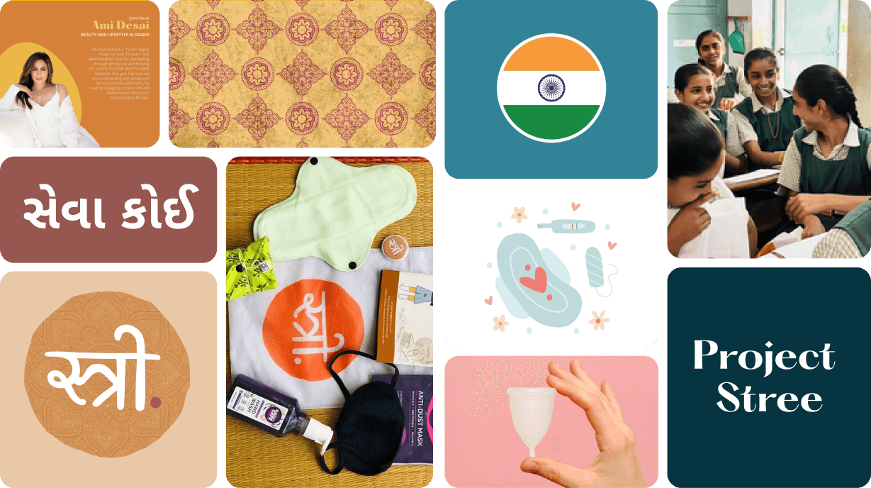


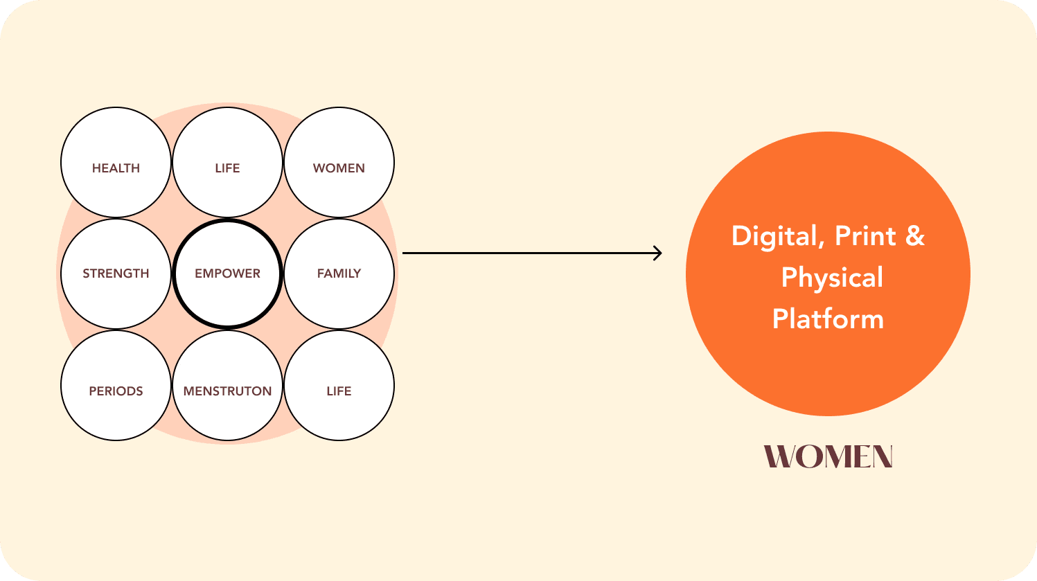


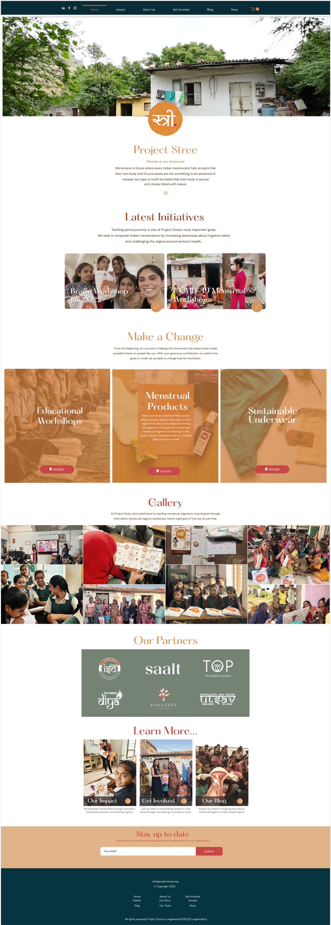
Home Page
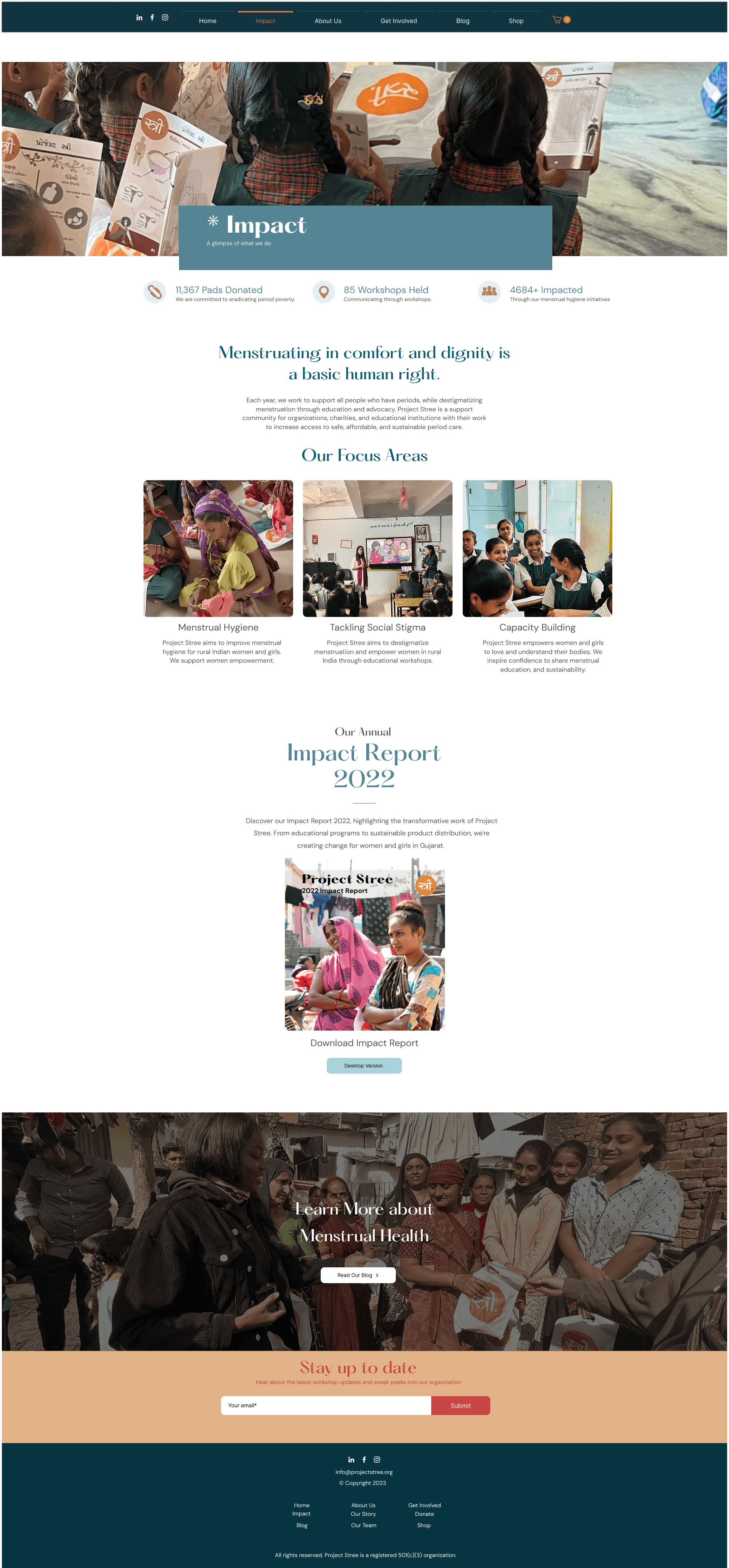
Impact Page
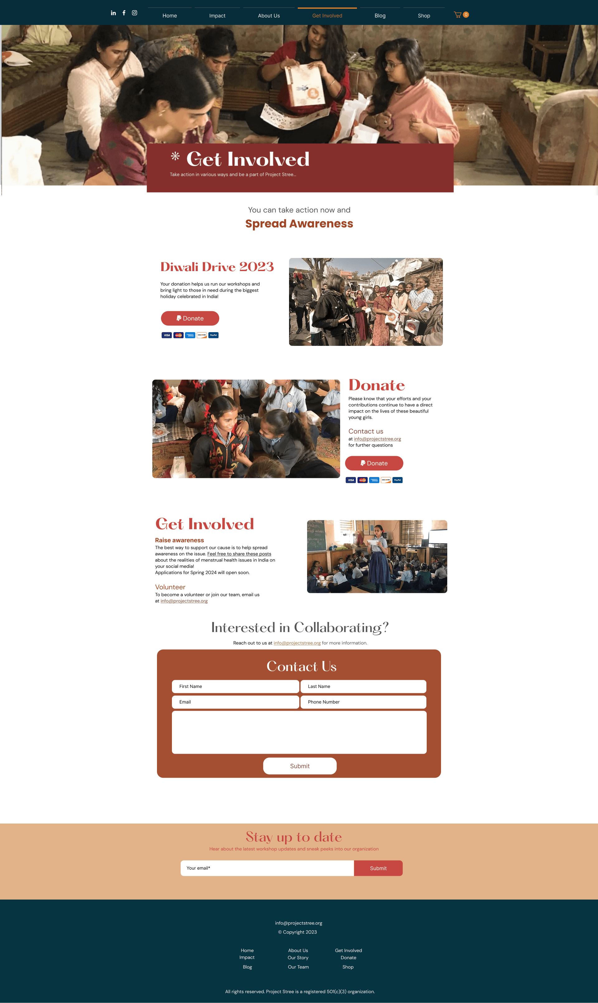
Get Involved Page
USER FRIENDLY
Icons & CTA's &
Navigation
We created distinct, practical call-to-action elements for the site, ensuring they meet WCAG accessibility guidelines. Our goal was to accommodate our diverse visitor demographic and advance our mission.
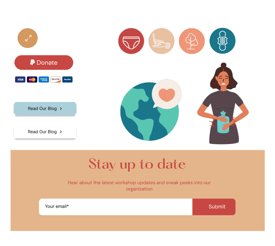
EASY NAVIGATION
Designing cards for
easy navigation
We ensured that all our data is organized hierarchically, enabling users to comprehend and interpret information more effectively. Also, we were considerate about the usage of accessible and universal typescripts.
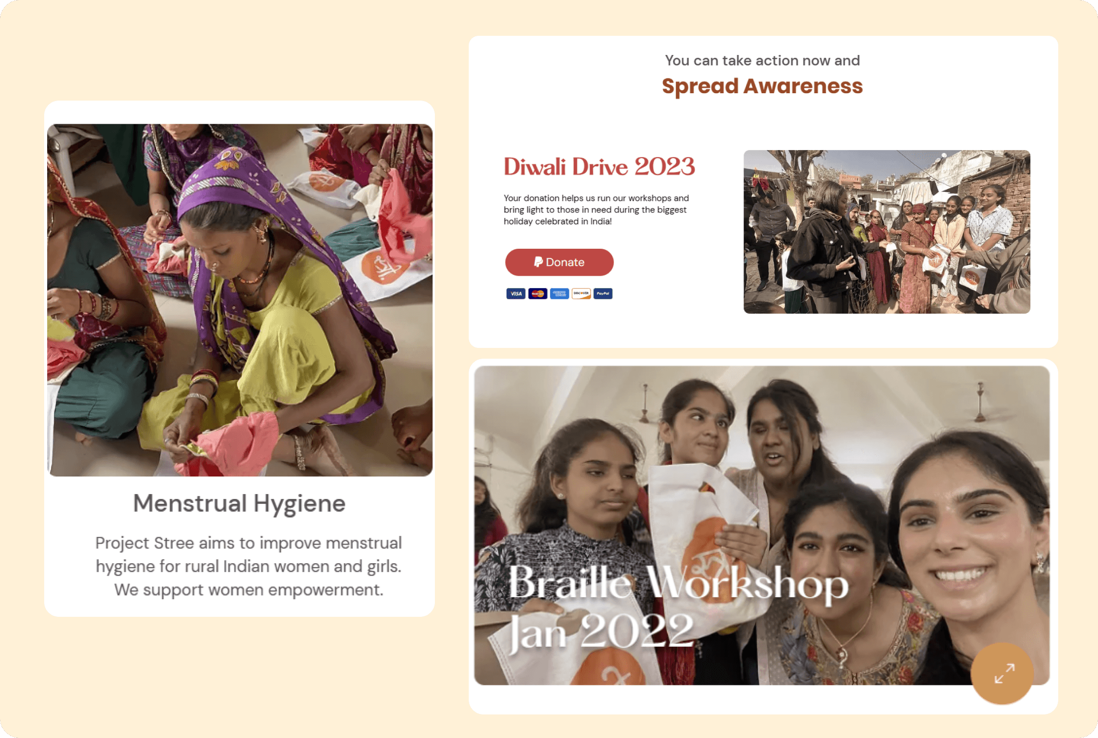
HOVER ANIMATIONS
Decluttering Information
We added subtle hover variations and animations to enhance site interactivity.
A mobile version was also created, omitting some desktop animations, to ensure clear information delivery since most customers first access the site via mobile.

The transformation was more than just visual—it was experiential.
After the launch, we analyzed key metrics from our WIX dashboard to measure the impact.
The Impact
Website Engagement Increased, in first 3 months
as a result of interactive storytelling, user-focused design, and intuitive navigation, leading to a stronger connection between visitors and the platform.
70%
Merchandise sales generated additional revenue
leveraging brand identity and ethical design, allowing the organization to fund more community programs sustainably.
Overall
Mobile bounce rate decreased
attributed to clearer CTAs, emotional storytelling, and an optimized donation flow, making contributions more intuitive and meaningful, reflecting a more accessible and user-friendly experience with faster load times and improved usability.
50 %
Working with Project Stree reinforced my belief in design as a catalyst for change.
Through thoughtful UX, branding & storytelling, I didn't just improve a digital presence
— I helped amplify voices that deserved to be heard.
KEY TAKEAWAYS
Emotion-Driven Design
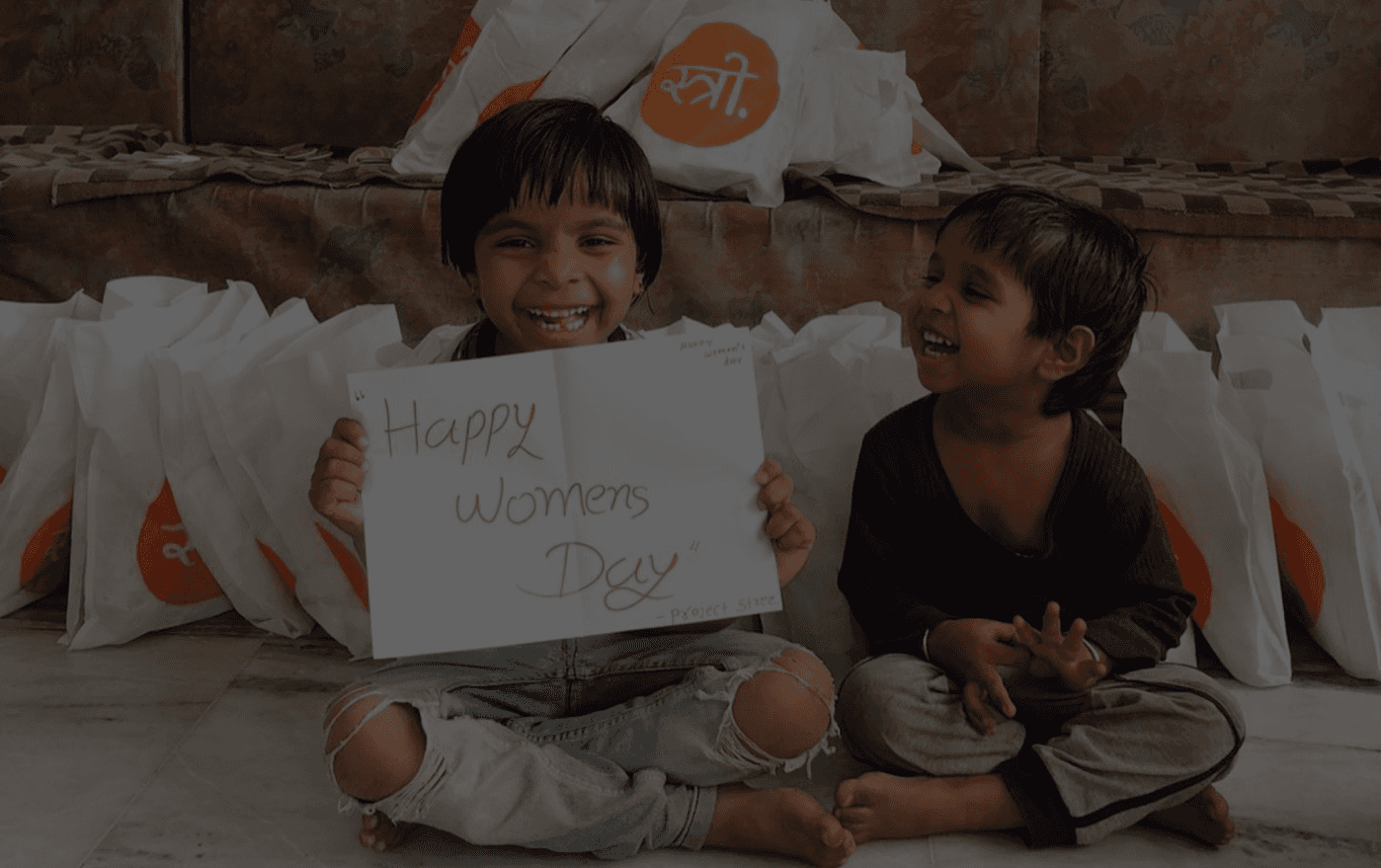
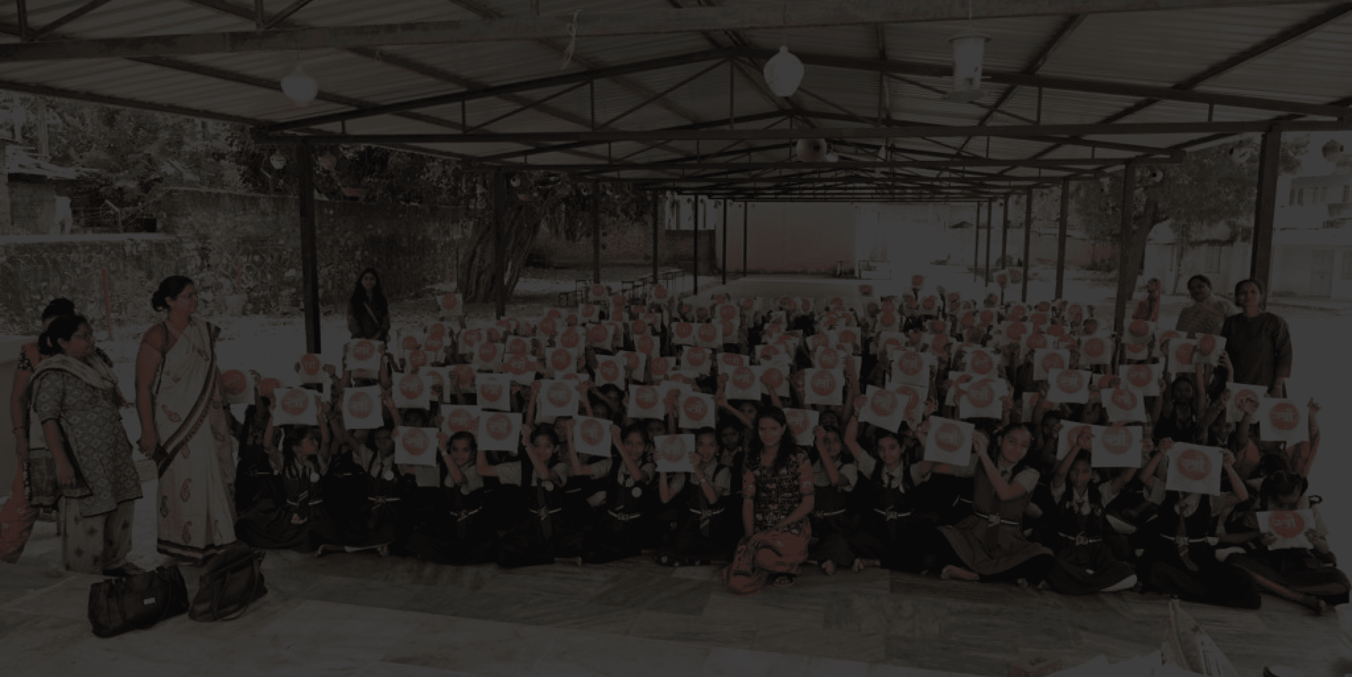
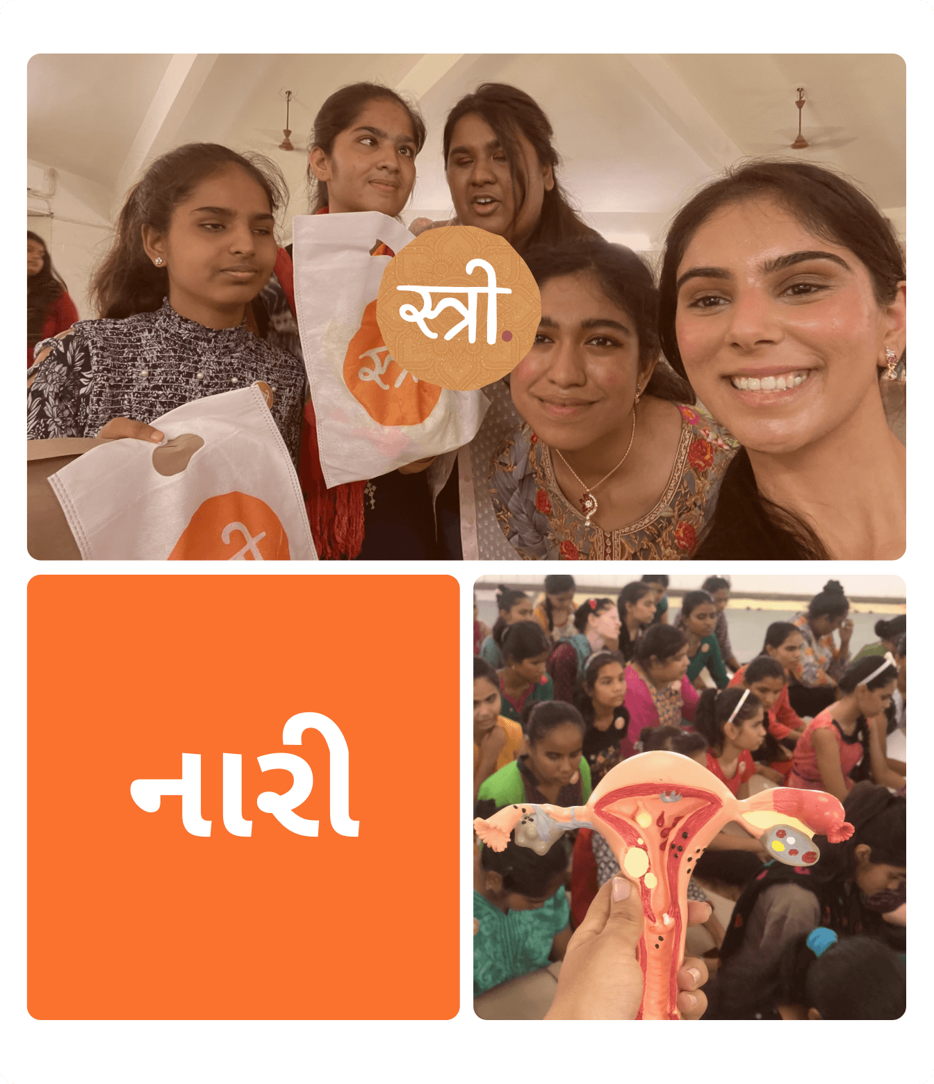
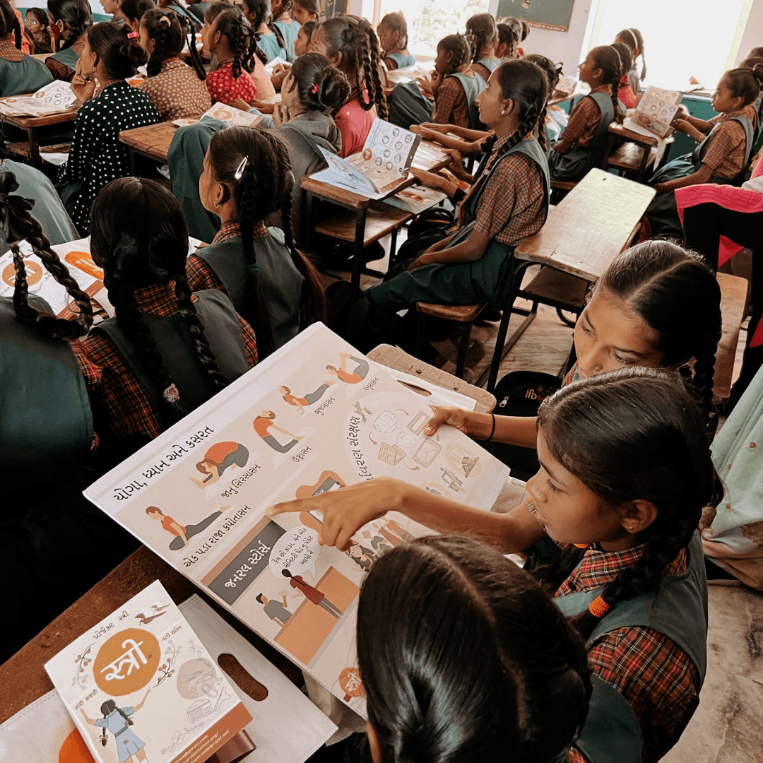
Users connect with authentic stories, so we used real pictures, and rooted in our design.
Inclusivity in Design
Ensuring accessibility and cultural relevance broadens reach and impact.
This project wasn't just about design—it was about empowerment, storytelling, and making a real impact.
I project close to my heart, where design became a voice for empowerment, education & change. :)