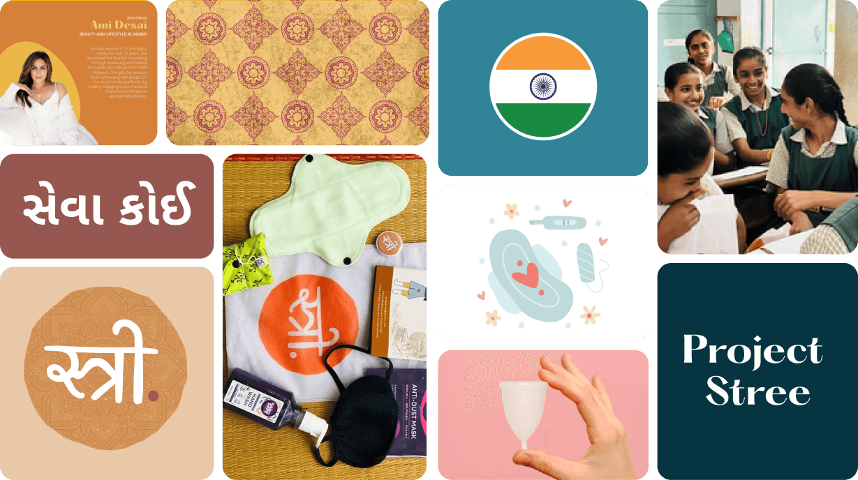


Project Stree
designing branding for web, print & mobile
MOBILE APP | WEBSITE | BRANDING| PRINT | Service Design
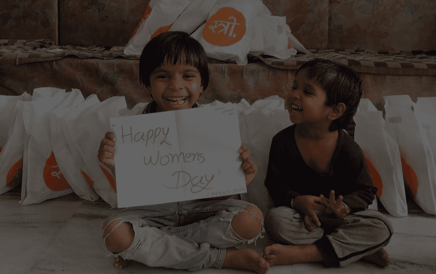
PROJECT STREE
Empowering women of India
It's huge. Immense. Vast.
We're embarking on a rebrand journey.
I am thrilled to present our reimagined brand, capturing our forward-moving direction — ubiquity.

What is Project Stree?
A education-first non-profit platform designed to tackle period poverty, build financial trust, and mobilize volunteer action across India.
Project Stree is a non-profit fighting period poverty and driving healthcare equity in India. To scale its impact, we transformed its static, brochure-style website into an action-oriented, donation-first ecosystem that simplifies contributions, builds trust, and accelerates volunteer signup.
Project Stree is a 501(c)(3) certified nonprofit that fights for women’s empowerment in India through menstrual hygiene education.
Problem
Project Stree’s outreach relied on a static, brochure-style website — impact was happening on the ground, but donors and volunteers had no easy way to see it or act on it.
Solution
We rebuilt the platform into an action-oriented, donation-first ecosystem with a distinct visual identity that simplifies giving and accelerates volunteer signup.
Results
Scaling outreach from 50 to 100+ workshops in five years, with a rebrand that drove stronger donor trust and volunteer signups.

My role as a Ux & Brand Designer
MY ROLE
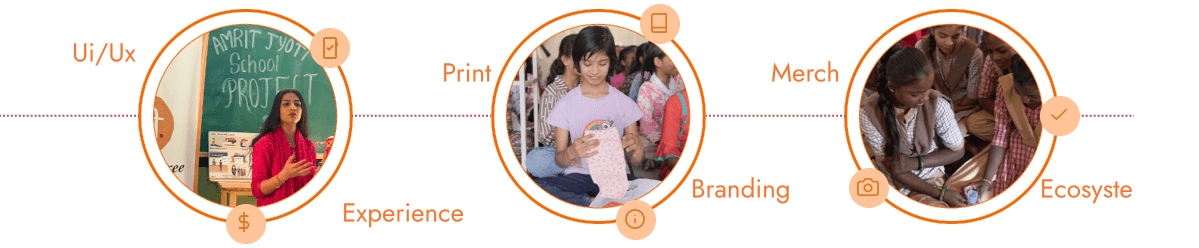
Driven by a passion to design for the greater good, I volunteered my skills as part of a 2-designer team to lead Project Stree's end-to-end transformation.
My work bridged holistic brand strategy with digital product design, spanning brand identity, print collateral, merchandise, and a donation-first web platform designed to build donor trust and scale volunteer action
Volunteering for Impact: Dedicated my time as a pro-bono designer, partnering with a co-designer to advance women's healthcare equity for the greater good.
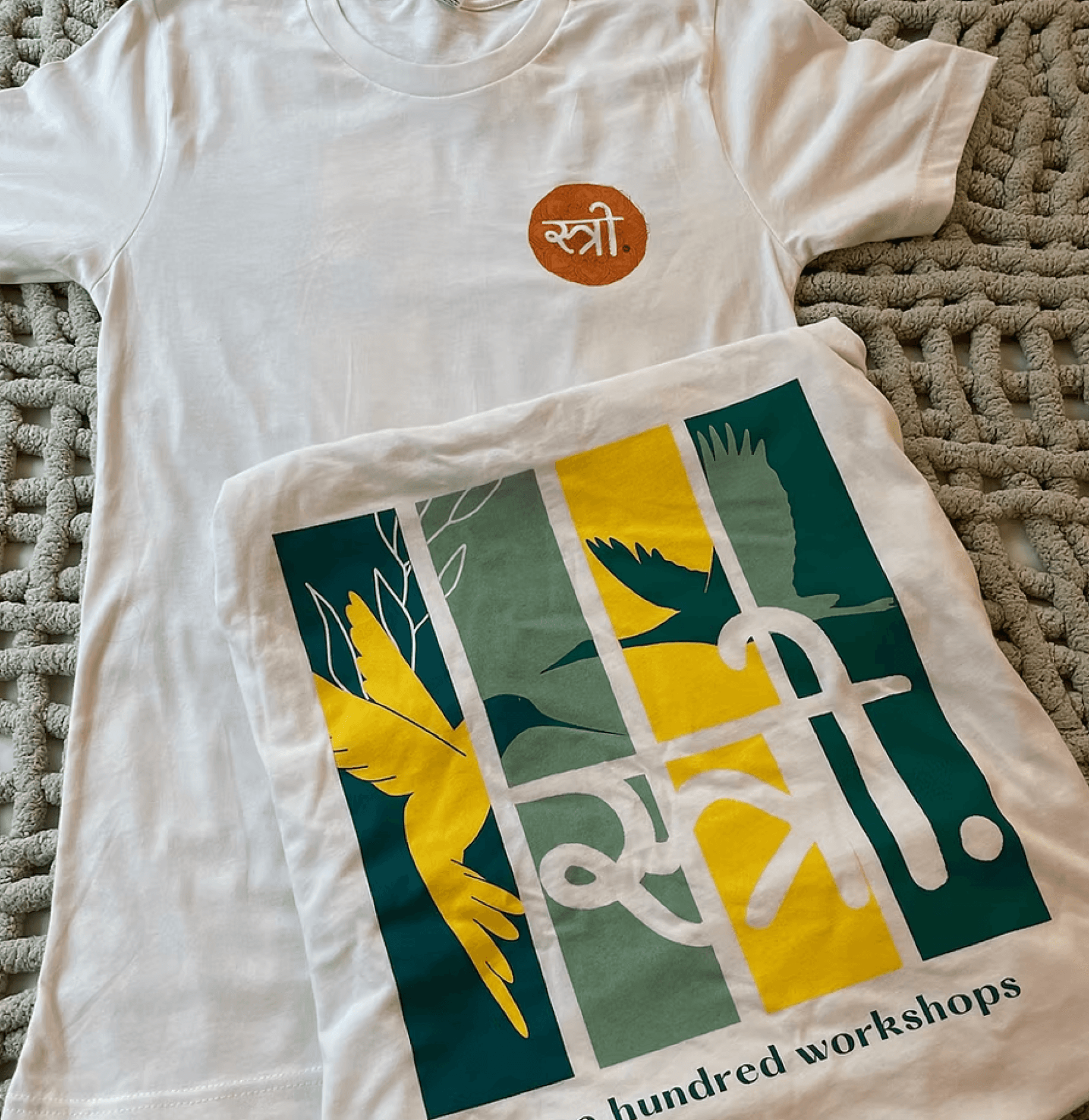
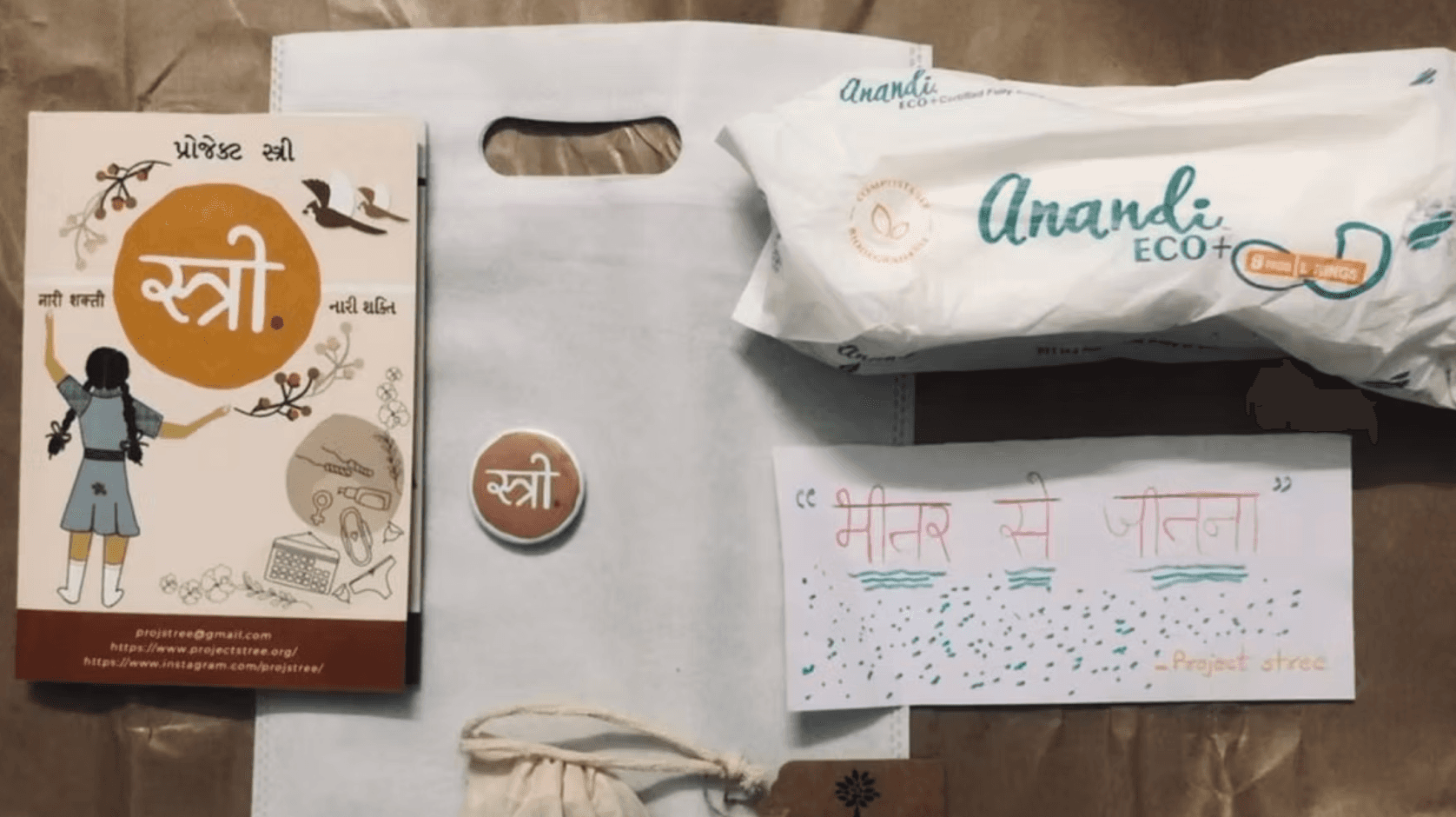
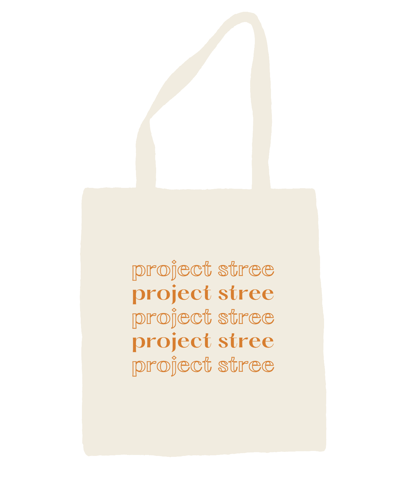
Print & Workshop Merchandise: Created educational guides, hygiene kit packaging, event posters, tote bags, and custom hoodies/sweatshirts across 100+ community workshops.
Education-First Web Experience: Partnered to build an accessible health-education portal integrated with dynamic donation impact tracking and streamlined volunteer signup.
Collaborative Brand Identity: Co-designed a dignity-first visual system (typography, color palette, logo) to transform menstrual health from a taboo subject into an empowering movement.
How we scaled Project Stree’s impact from
50 to 100+ workshops in 5 years ??
121+ Workshops
Educating through workshops.
8,454 Impacted
through hygine inivitaes
15,400 Pads donated
Educating through workshops.
THE 30 SECOND VERSION
How do we create a brand that speaks volumes?
We wanted to create an experience that not only draws inspiration from the world but also enhances it. We wanted to redefine the visual vocabulary of menstrual health in India. Transitioning Project Stree from a grassroots NGO to a globally recognized, professional brand that empowers rather than pathologizes.
The "Why Now" - Industry Context
Project Stree reached a critical inflection point….
To scale from local workshops to state-wide impact in Gujarat, the organization needed more than a website—it needed a Visual Operating System.
My goal was to create a brand that didn't just 'ask for help,' but 'led a movement,' transitioning the visual language from a narrative of scarcity to one of sovereignty.
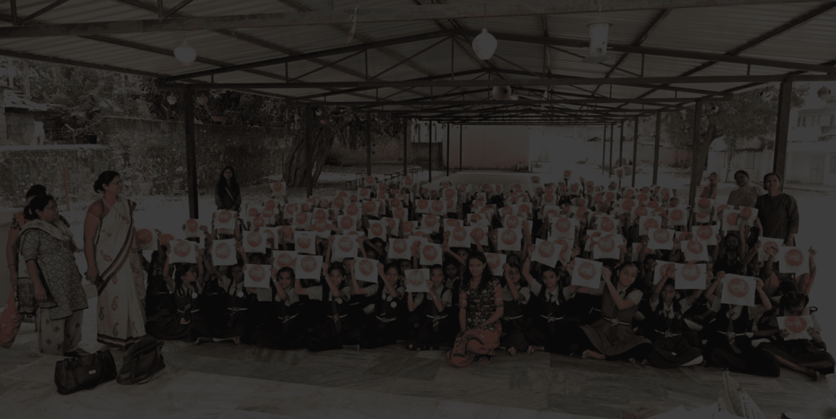
The Challenge: A Disconnected Service
When I joined the team, Project Stree faced several challenges:
Their digital presence lacked consistency and impact.
There was no unified brand identity across platforms.
Their website and mobile experience weren’t optimized for engagement or storytelling.
Reports and merchandise lacked a strong visual connection to their mission.
The Beneficiary
(Rural Women in Gujarat)
Needs accessible, stigma-free health literacy, clear guidance on product usage, and local workshop details presented in a dignifying visual format.
Dignity & Health Literacy
Provide localized, culturally sensitive educational guides and clear access to community health resources.
The Volunteer
(The Facilitator)
Requires a frictionless sign-up flow, clear training resources, and downloadable workshop toolkits to organize local field drives effectively.
Frictionless Action & Mobilization
Deliver a streamlined 3-step onboarding journey and access to event collateral, apparel, and hygiene drive kits.
The Donors/Supporters
(Global Philanthropist)
Find the nearest organic waste disposal locations. Check the level of waste accumulation before visiting to make your drop-off easier.
Transparency & Impact Tracking
Needs clear financial transparency and real-time impact tracking to see how donations convert into direct, tangible aid.
?
DESIGNING FOR TRUST, EMPATHY AND CONVERSATION
User Archetypes &
Behavioral Mapping
?
?
?
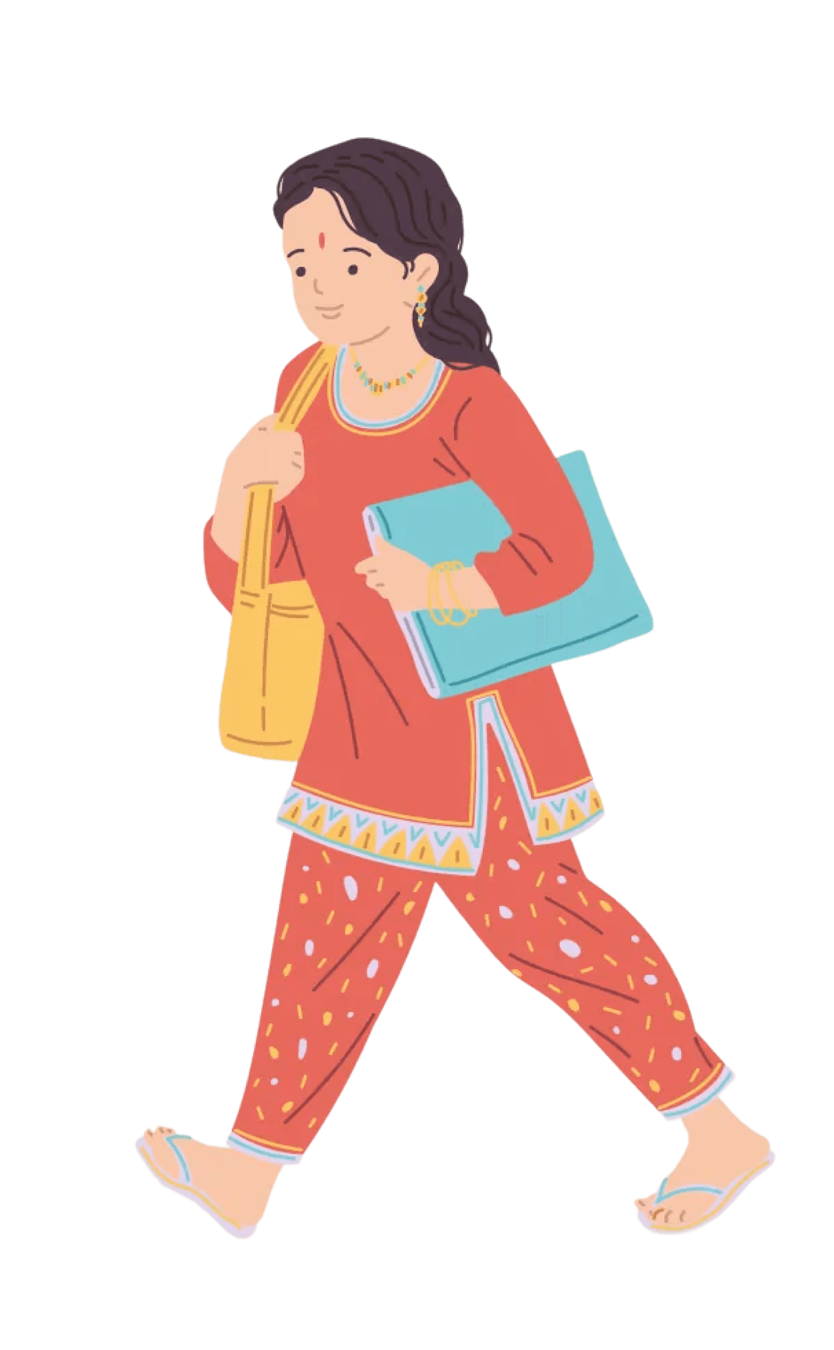
CONTEXTUAL RESEARCH
Understanding the Users
A digital platform is only as effective as the behavioral change it drives. For Project Stree, the core challenge extended beyond distributing information—it was navigating deep-seated cultural stigma surrounding menstrual health.
To build an education-first, donation-backed ecosystem, we moved beyond a single "general user" model. We mapped the distinct motivations, barriers, and needs of three core archetypes to design a dignity-first experience.
SOLUTION
Brand
Identity
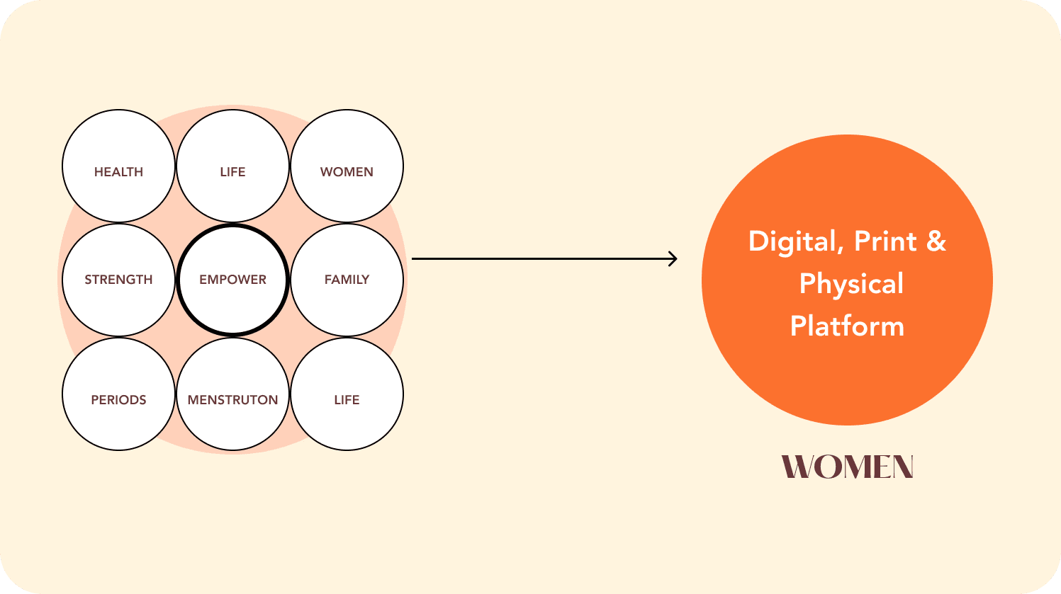
Building a unified brand identity
Key words identified
brand elements identified
The foundations that fuel our design drive.
The why behind our designs, the goals that keep us on track and always looking forward. We shortlisted the keywords that we thought explained Project Stree the best, and what would our brand voice be.
SOLUTION
Brand
Identity
The why behind our designs..
From a competitive semantic audit, we figured most NGOs use pink (stereotypical/juvenile) or blue (clinical/detached). We wanted to create a color palatte inspired by the vibrant hues of India, guided our choice of colors.
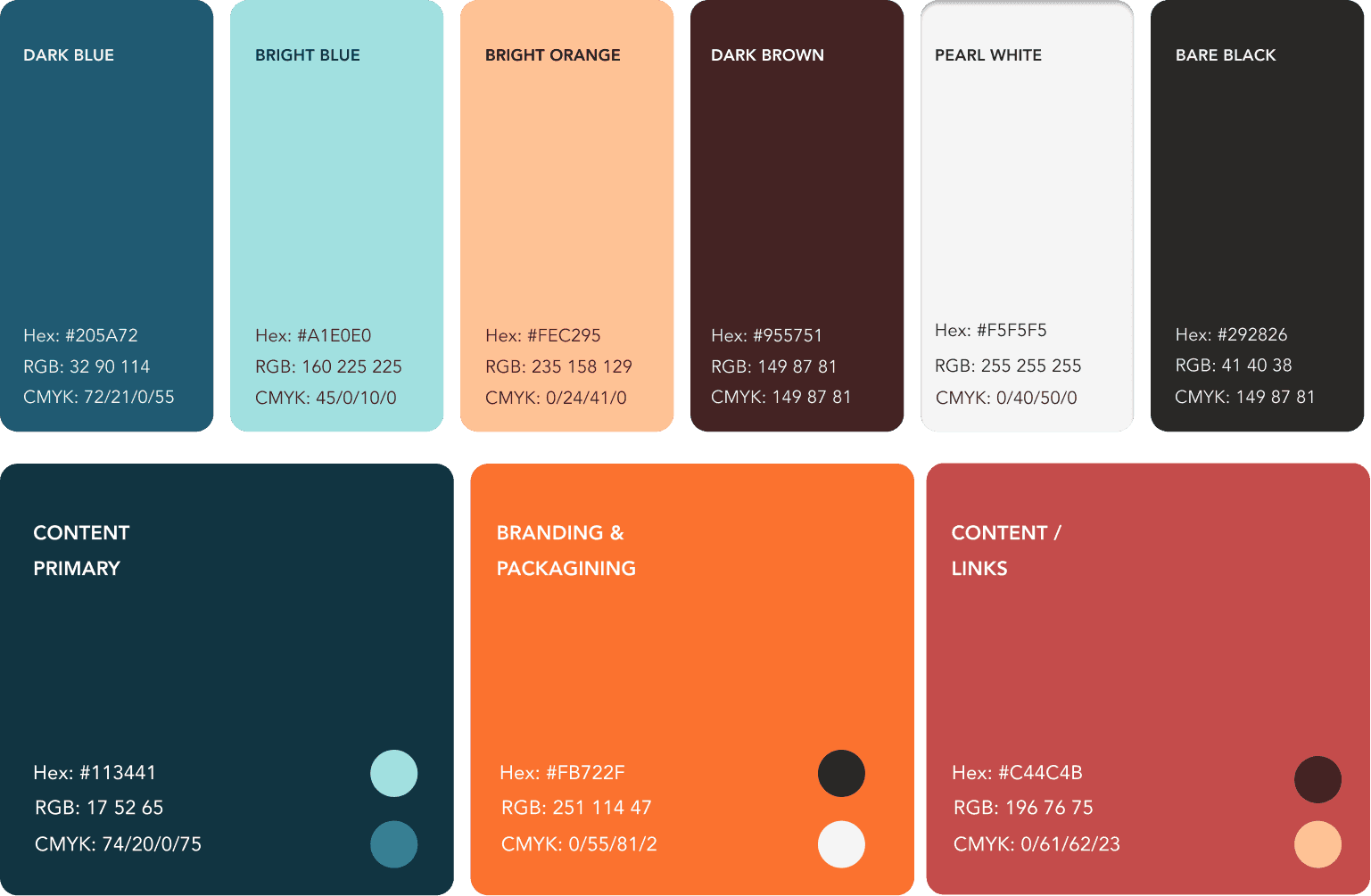
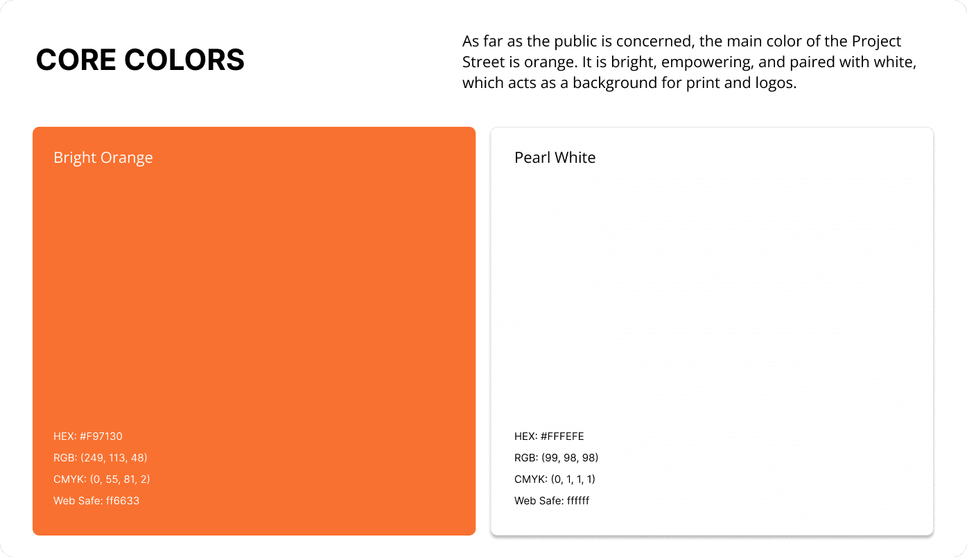
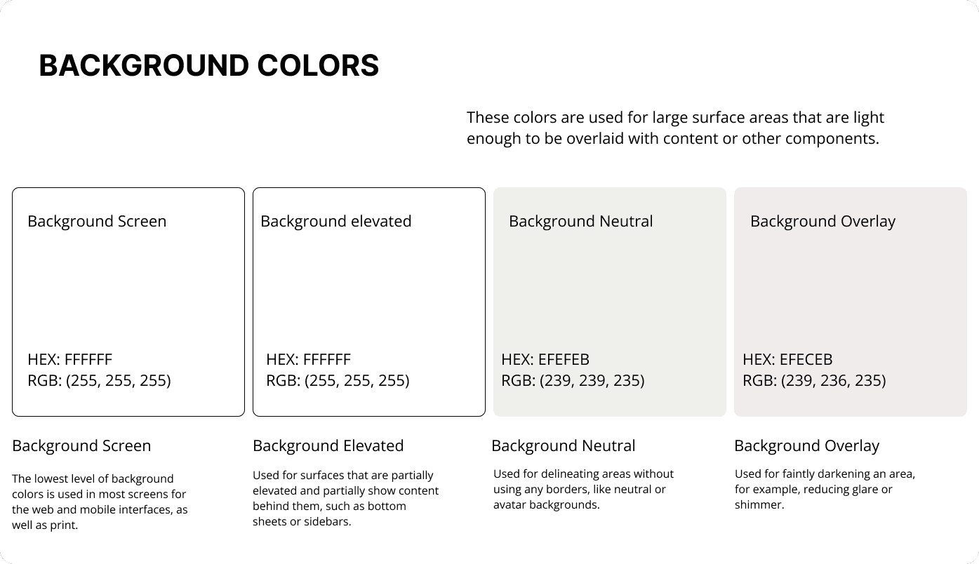
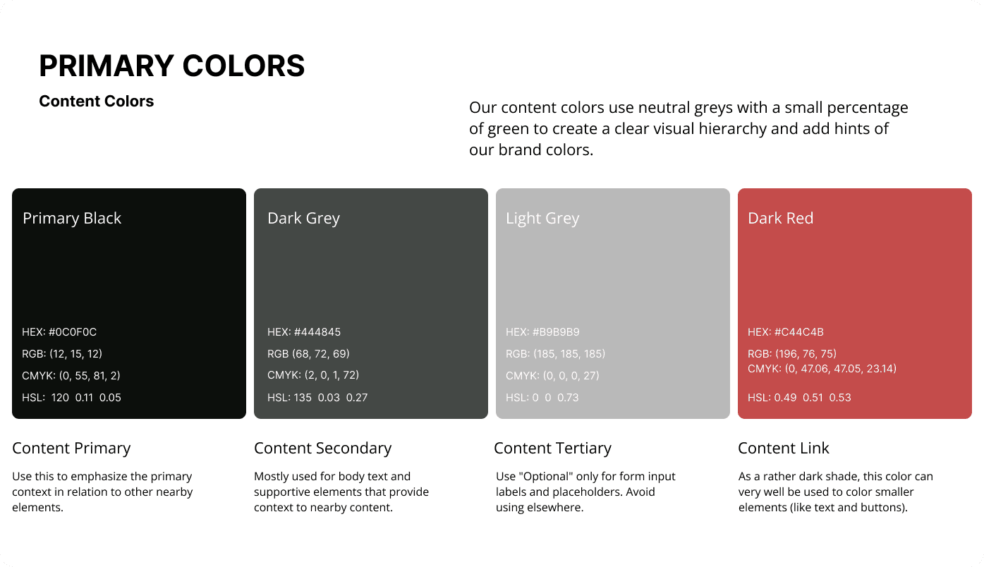
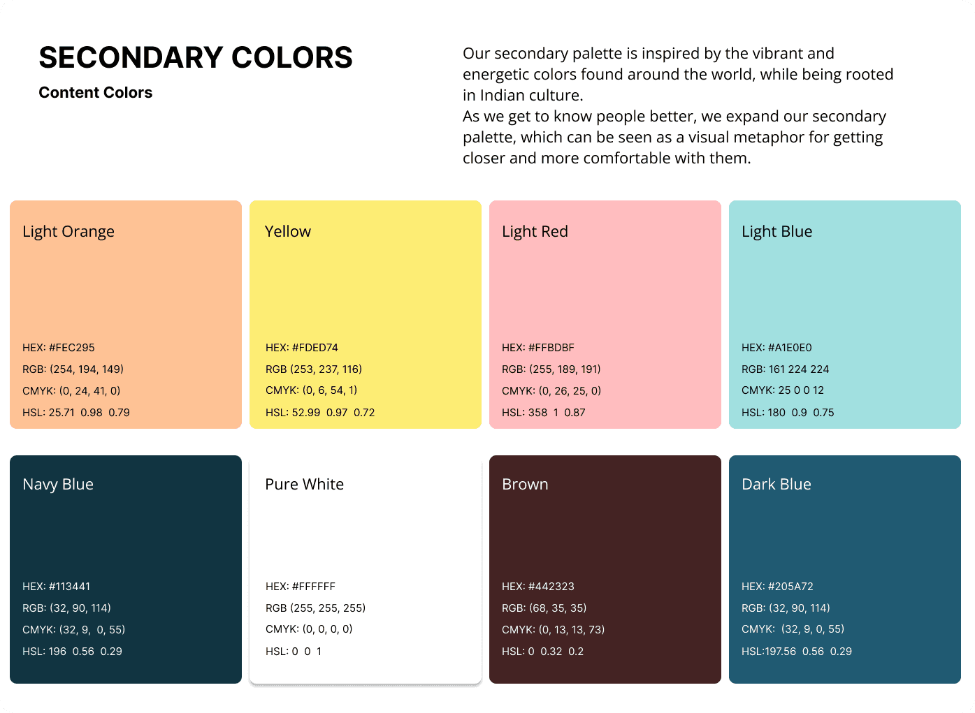
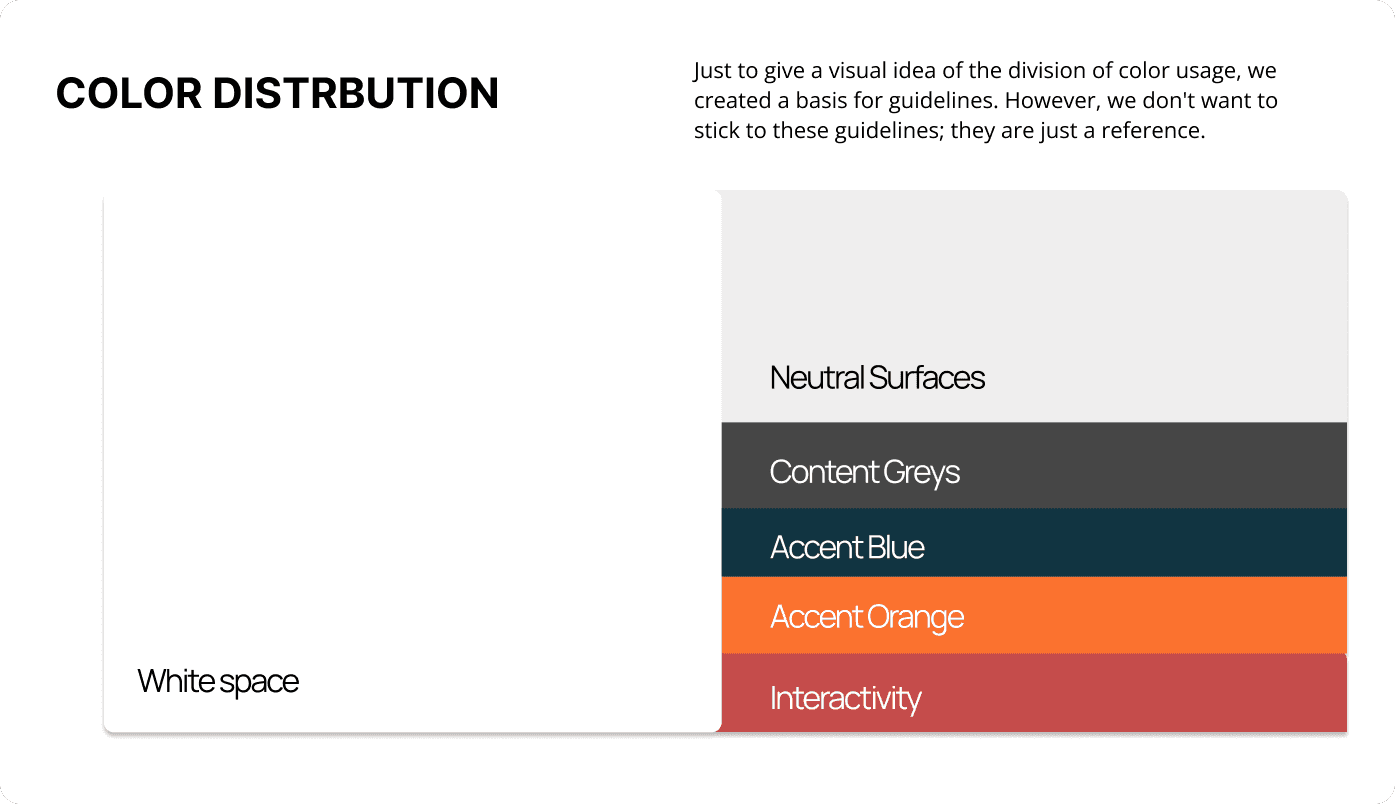


Primary Content (Deep Teal & Pearl White)
Establishes high contrast and readability for educational reading materials while meeting strict WCAG accessibility standards.
Branding & Packaging (Bright Orange & Terracotta)
Warm, energetic hues for packaging and posters that frame menstrual equity around dignity and celebration instead of clinical taboo.
Designed the Product:
Built the UI flows and component system that turned academic AI into an enterprise platform.
SOLUTION
Theme
Goal
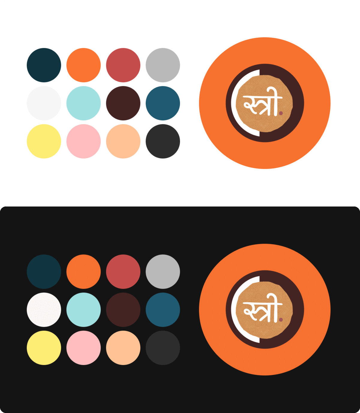
Works well in both Dark Mode & Light Mode.
We followed that the brand guidelines adhered to the WCAG
(Web Content Accessibility Guidelines) ensuring proper contrast.
We ensured accessibility was on the core of our principles.
BRAND STRATEGY
Hue arrangement deeply, mirrored the branding profile..
Our brand strategy answers that and more, giving direction to everything we create from print, poster to web. It couldn't be more personal to us, so as much as we'd love to tell the world about it, this is the one thing we keep to ourselves.
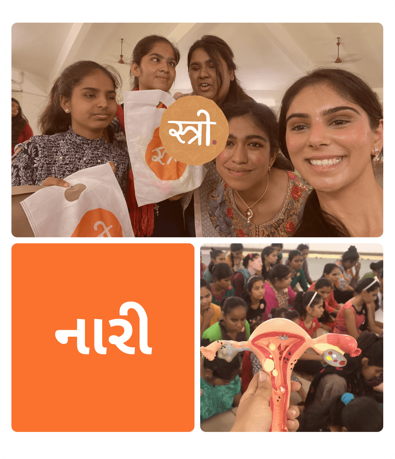
Our brand strategy gives direction to everything we build, from print materials and event posters to the web experience. It couldn’t be more personal to us, so as much as we’d love to tell the world about it, this is the one piece we keep to ourselves.
રસ / रस / Rasa
FONT & TYPEFACE
Unique typeface to match our unique brand
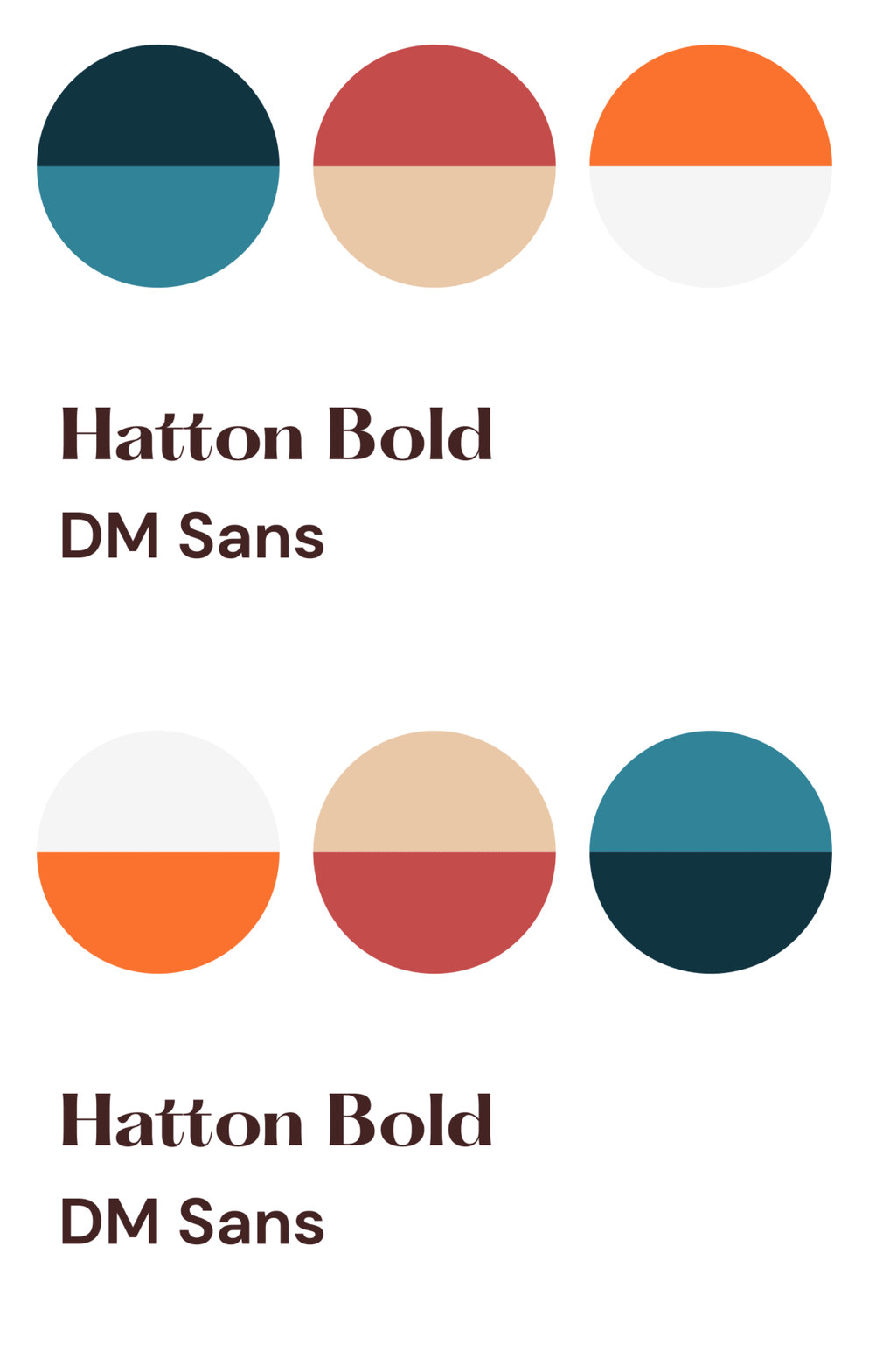
We paired Hatton Bold and DM Sans for a confident brand voice, integrating Rasa to bring equal typographic dignity to local, non-English audiences.
LOGO DESIGN
Simpler, Clearer Logo Variations
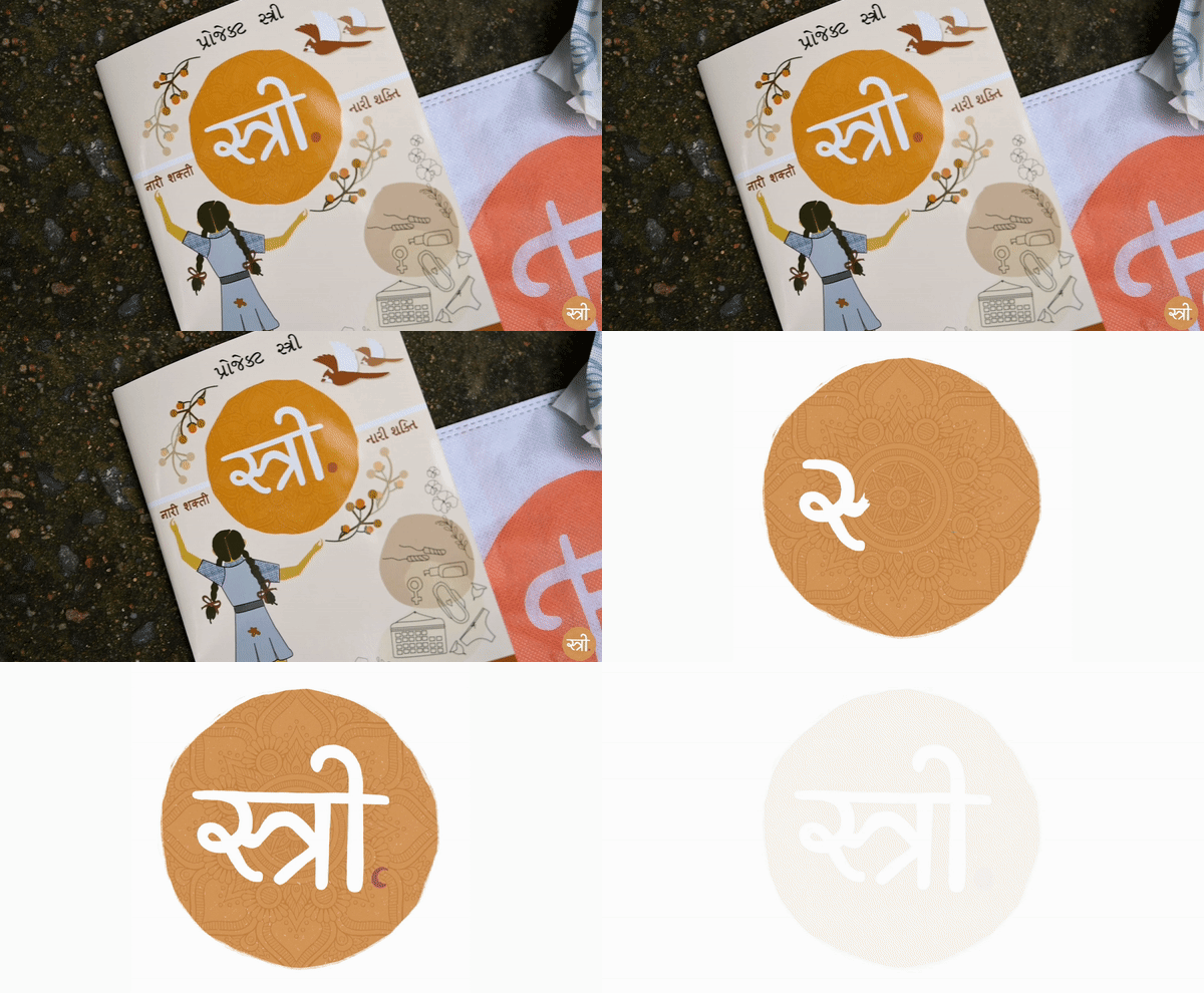
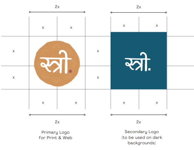
The logo blends Devanagari script for "Stree" (woman) with a mandala bindi motif, supported by clear usage guidelines for print sizing and photography overlays.
FONT & TYPEFACE
Designing for Print & Field Collateral
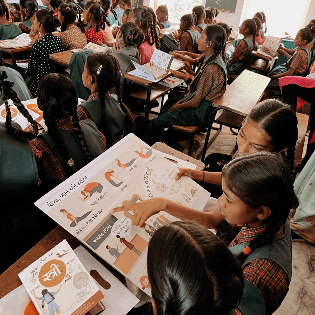
We designed accessible print media, brochures, and impact reports that seamlessly carried the brand identity to educate underserved communities clearly and engagingly.
The Workshop in a Box
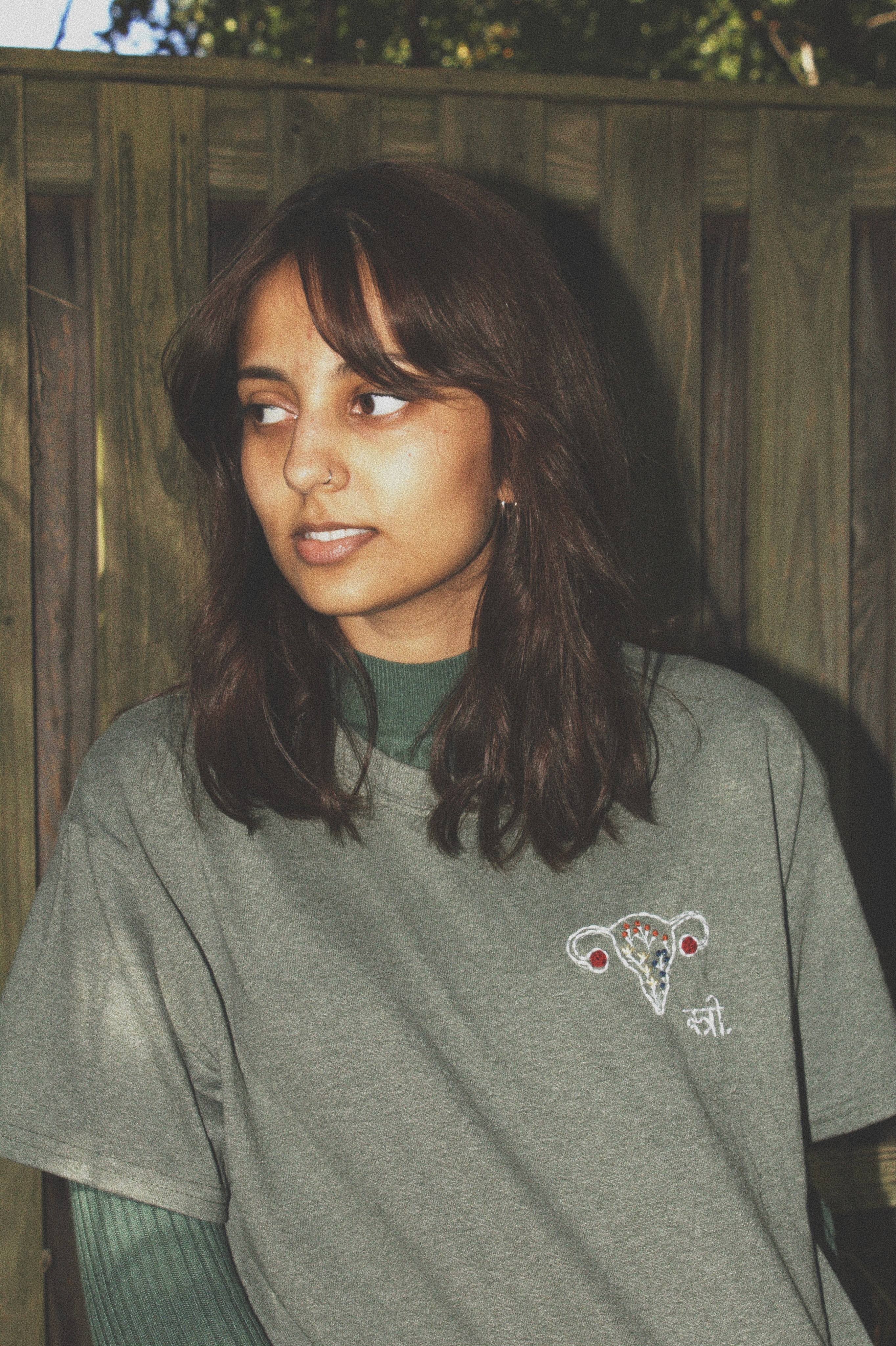
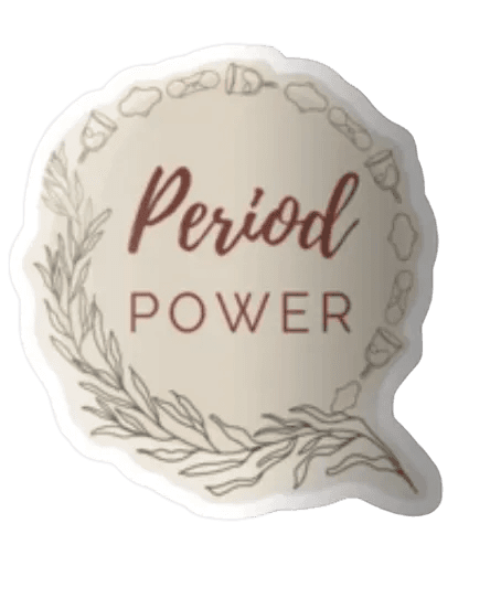
An interactive merchandise ecosystem ranging from apparel to workshop collateral—strategically built to drive social advocacy. We successfully managed the lifecycle from concept to production, with a focus on a non-profit business model where all proceeds supported community-focused initiatives.

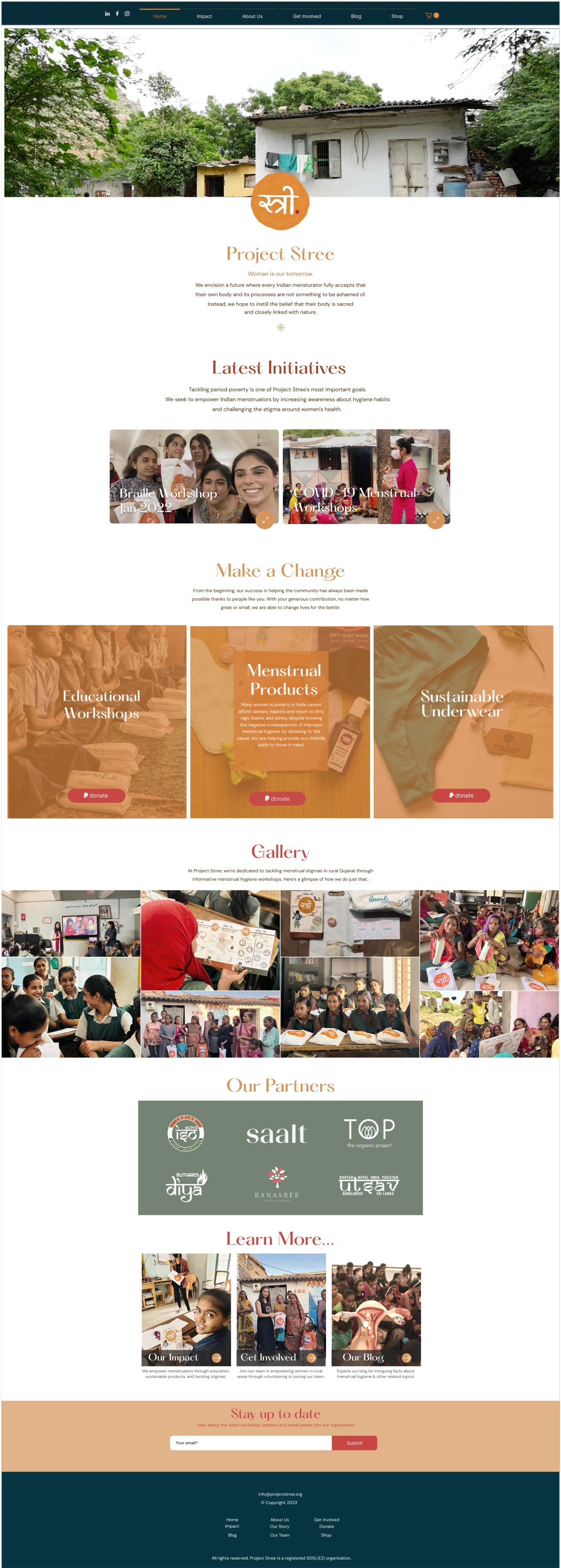
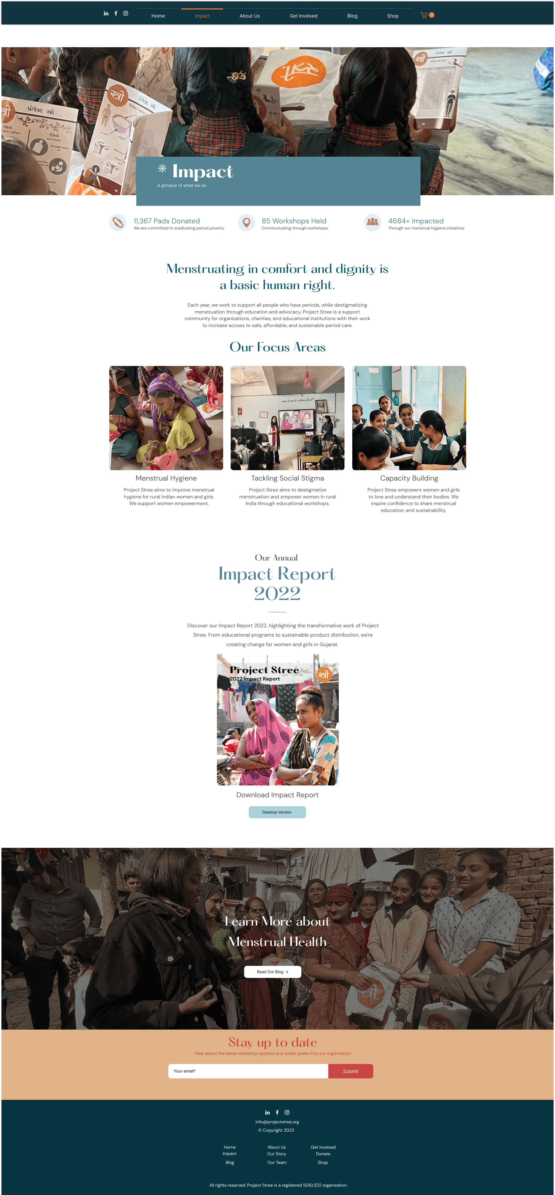
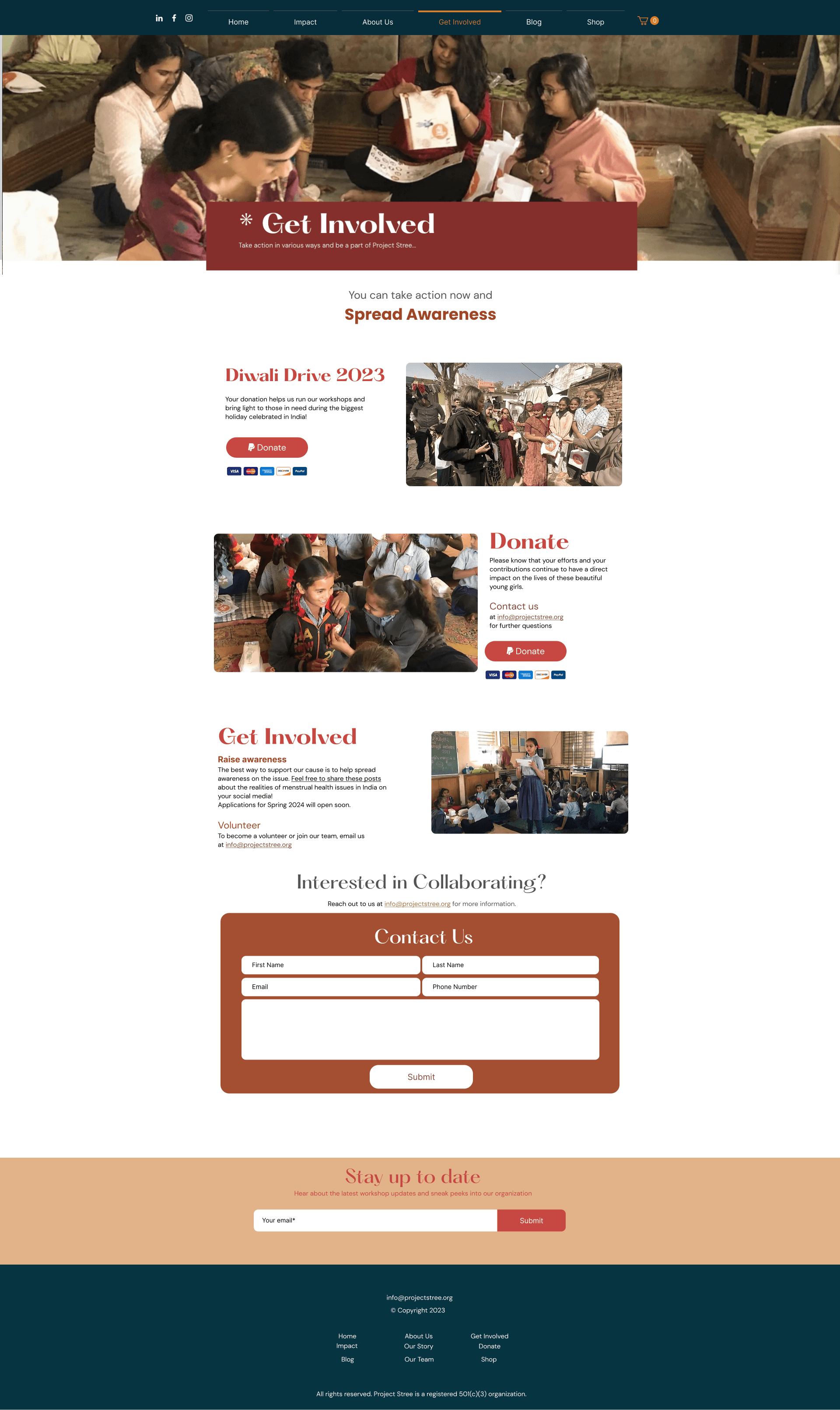
Home Page
Impact Page
Get Involved Page
USER FRIENDLY
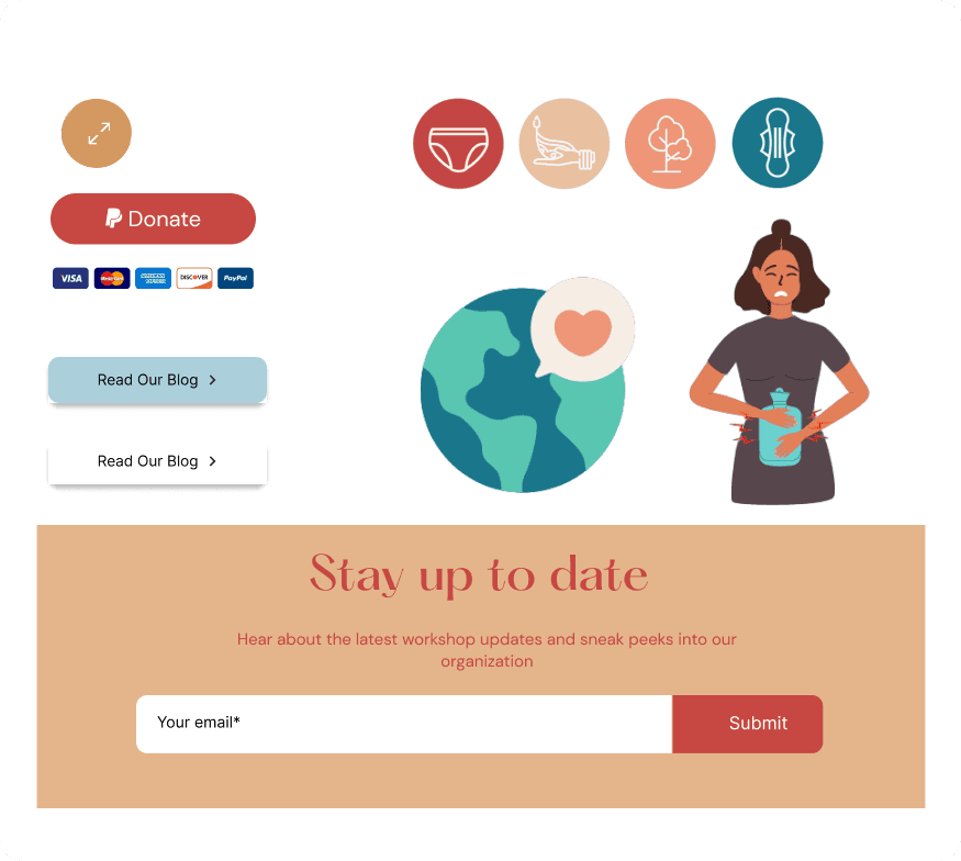
Icons & CTA's &
Navigation
We created distinct, practical call-to-action elements for the site, ensuring they meet WCAG accessibility guidelines. Our goal was to accommodate our diverse visitor demographic and advance our mission.
EASY NAVIGATION
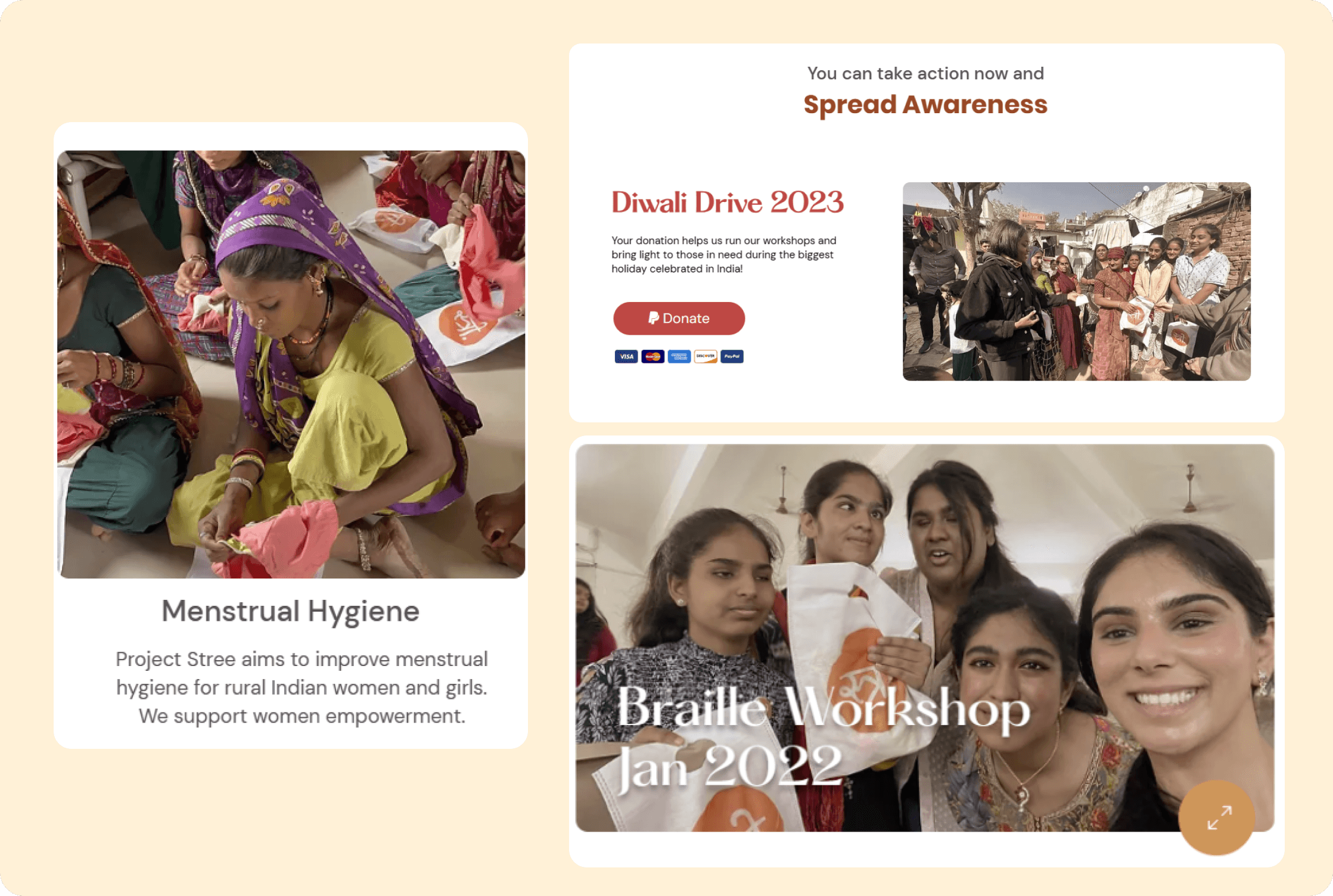
Designing cards for
easy navigation
We ensured that all our data is organized hierarchically, enabling users to comprehend and interpret information more effectively. Also, we were considerate about the usage of accessible and universal typescripts.
HOVER ANIMATIONS
Decluttering Information
We added subtle hover variations and animations to enhance site interactivity.
A mobile version was also created, omitting some desktop animations, to ensure clear information delivery since most customers first access the site via mobile.
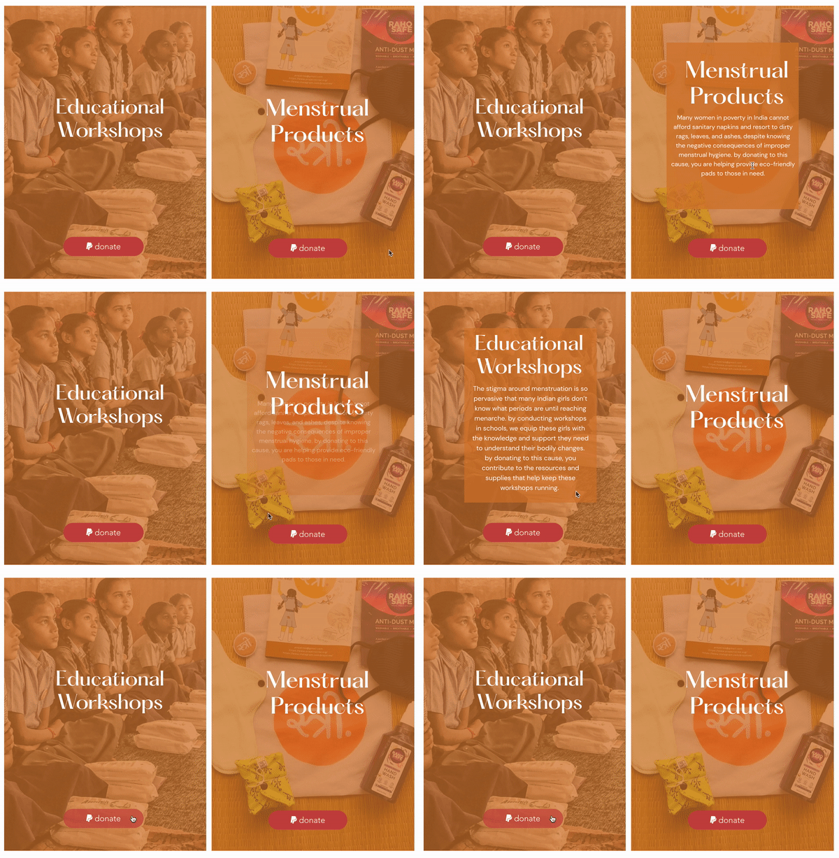
The transformation was more than just visual—it was experiential.
After the launch, we analyzed key metrics from our WIX dashboard to measure the impact.
The Impact
Website Engagement Increased, in first 3 months
as a result of interactive storytelling, user-focused design, and intuitive navigation, leading to a stronger connection between visitors and the platform.
70%
Merchandise sales generated additional revenue
leveraging brand identity and ethical design, allowing the organization to fund more community programs sustainably.
Overall
Mobile bounce rate decreased
attributed to clearer CTAs, emotional storytelling, and an optimized donation flow, making contributions more intuitive and meaningful, reflecting a more accessible and user-friendly experience with faster load times and improved usability.
50 %
LEARNINGS
Working with Project Stree reinforced my belief in design as a catalyst for change.
Through thoughtful UX, dignity-first branding, and human storytelling, we didn't just rebuild a digital presence—we helped amplify voices that deserved to be heard.
Empathy-driven design
Real human connection relies on authentic stories. By grounding our visual language in ground-level field narratives, we built trust and emotional resonance.
Inclusivity in Design
Accessibility goes beyond color contrast—it means designing for low-literacy and non-English speakers so everyone receives equal dignity and clarity.
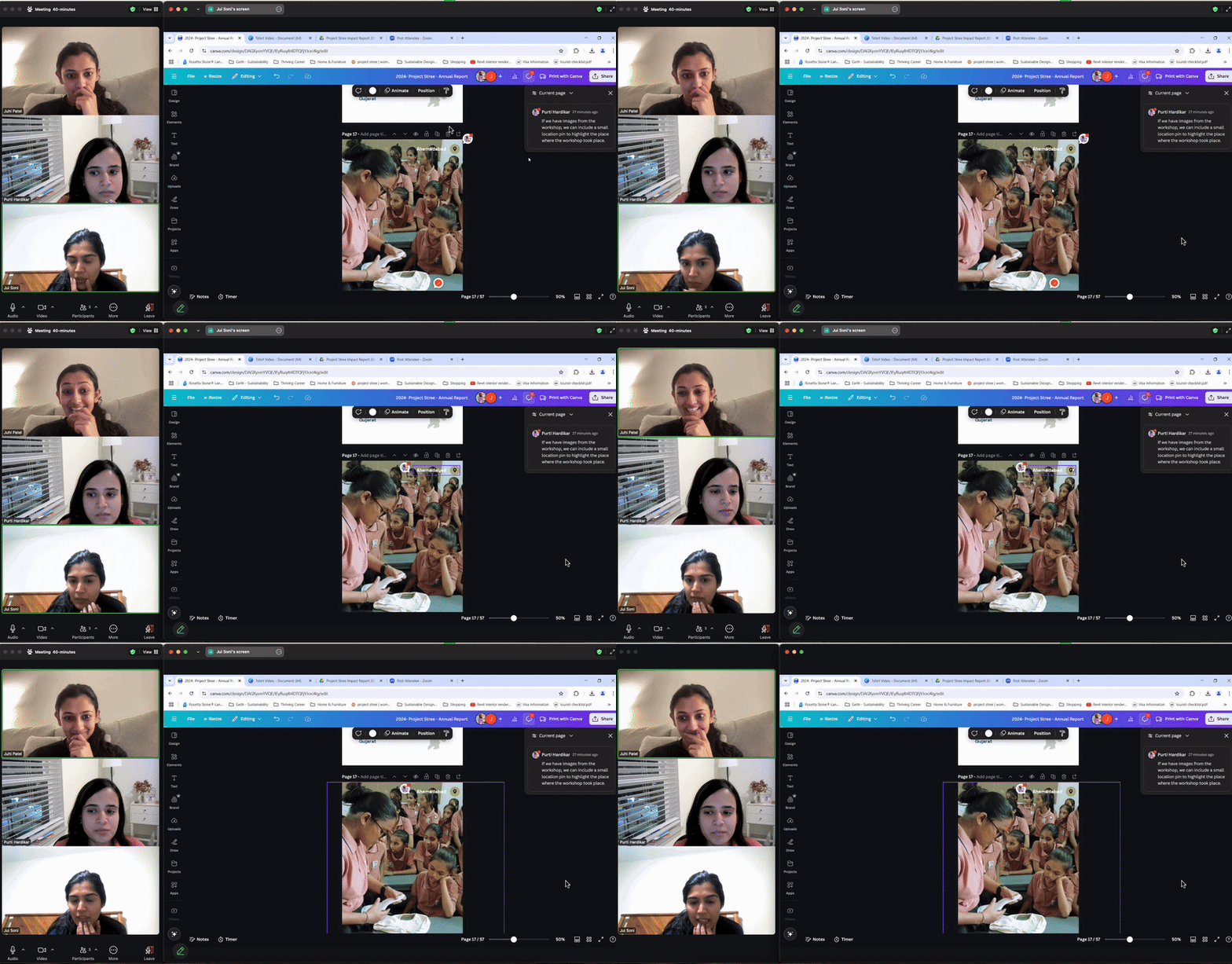
Behind the scenes of our design work session, refining prototypes and layout systems.
This project wasn't just about design—it was about empowerment, storytelling, and making a real impact.
I project close to my heart, where design became a voice for empowerment, education & change. :)