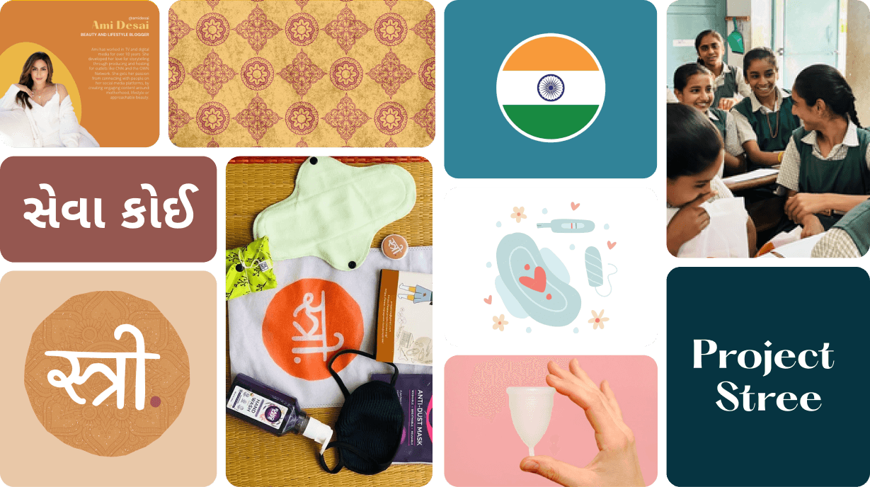
Project Stree
designing branding for web, print & mobile
MOBILE APP | WEBSITE | BRANDING| PRINT

PROJECT STREE
Empowering women of India
It's huge. Immense. Vast.
We're embarking on a rebrand journey.
I am thrilled to present our reimagined brand, capturing our forward-moving direction — ubiquity.

What is Project Stree?
Designing for Impact
"I don't just design screens, I design experiences that matter."
That was my mindset when I embarked on the UX journey with Project Stree.
Moving from India to the USA, I sought meaningful ways to stay connected and give back to my country, and when
I came across Project Stree, I knew I had to be part of it.
This project was more than just design work; it was a deeply personal endeavor. My connection to India, its people, and the challenges faced by women made this an opportunity to create more than just a brand identity.


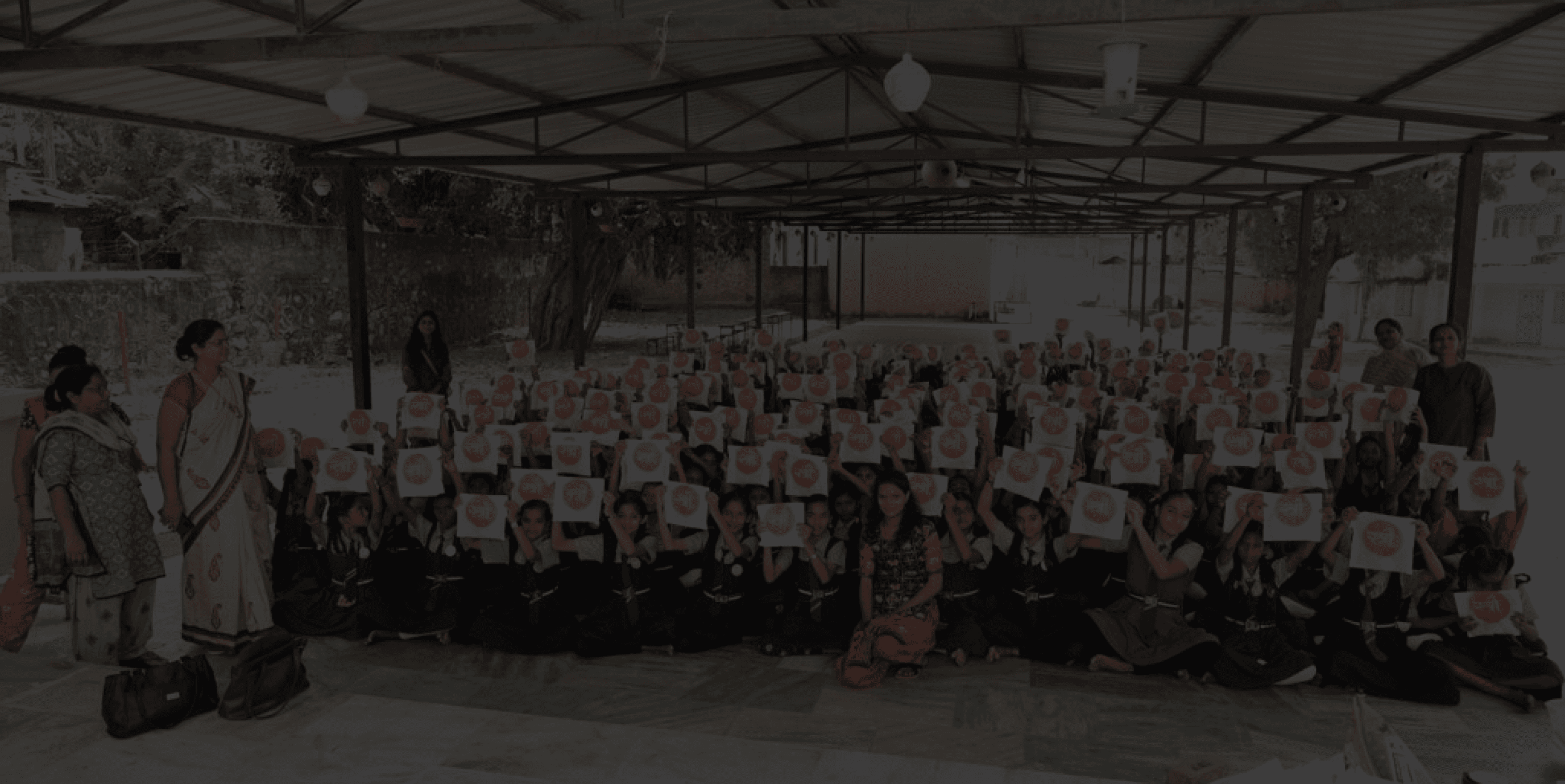
7,678 Women & Girls Impacted
Through our digital menstrual hygiene initiatives.
MY JOURNEY
MY GOAL?
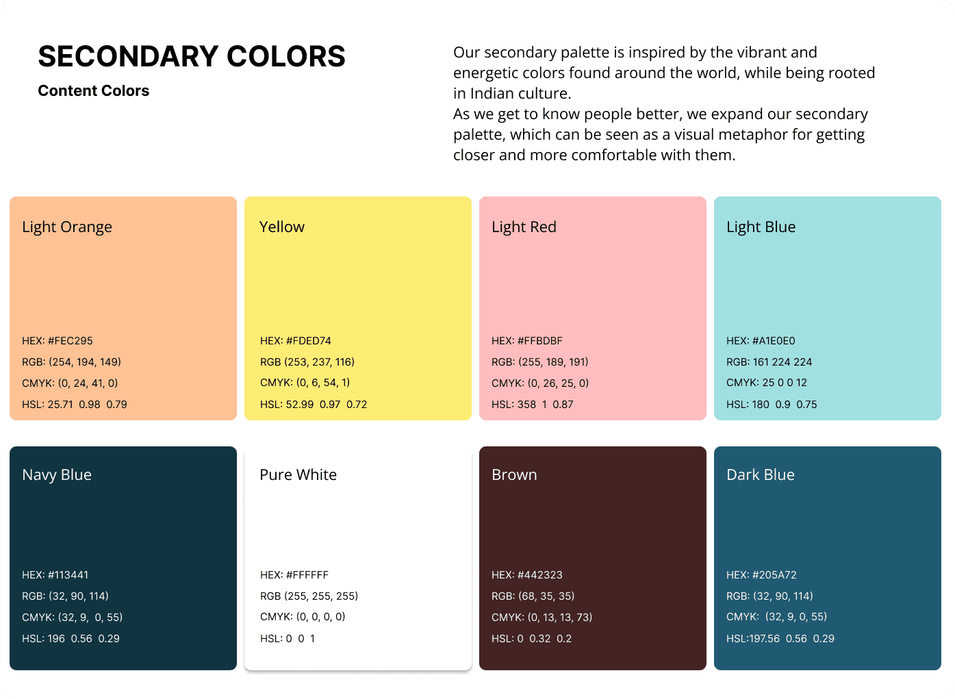
We wanted to create an experience that not only draws inspiration from the world but also enhances it. Each tint was carefully crafted to ensure it looks visually appealing while maintaining high readability, particularly when applied to surfaces and typography.

Understanding the Users
DISCOVERY
I started by conducting research, by interviewing beneficiaries, donors, and volunteers.
A quote that stuck with me:

Pain- Points Identified:
Inconsistent
Branding
Low
Engagement
Poor Mobile Accessibility
Reporting
Fatigue
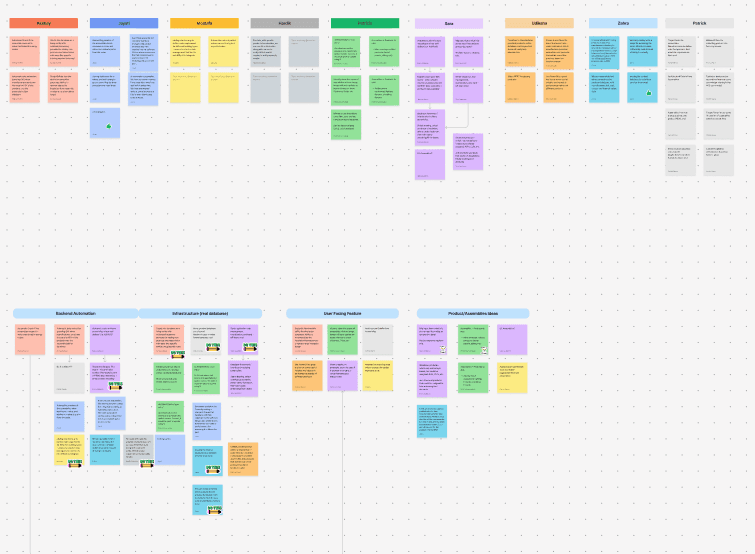
How did we approach the problem?
PROCESS
To systematically address these challenges, we structured our work into design sprints, ensuring iterative improvements and continuous feedback loops.
Each sprint focused on a key aspect of the brand identity and user experience.


Let's dig into the details..
Our new expression is energetic,
straight talking and bold.
Not to be disruptive, but because we believe in a
different way of doing things.
*

The why behind our designs..
We wanted to create a color palatte inspired by the vibrant hues of India, guided our choice of colors. The goals was to be rooted in our culture yet being bold and different. Scroll through >>


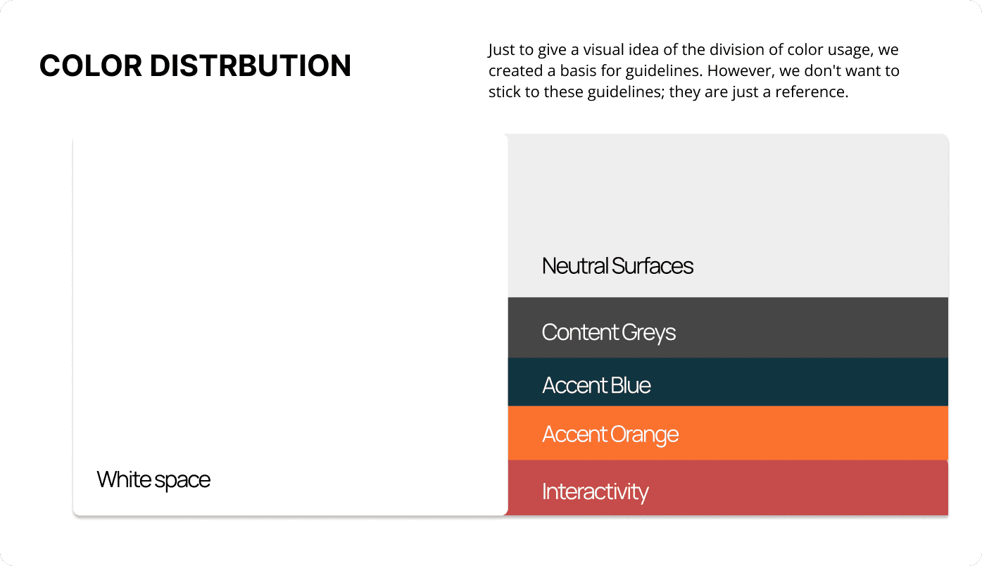

Works well in both Dark Mode & Light Mode.
We followed that the brand guidelines adhered to the WCAG
(Web Content Accessibility Guidelines) ensuring proper contrast.
We ensured accessibility was on the core of our principles.


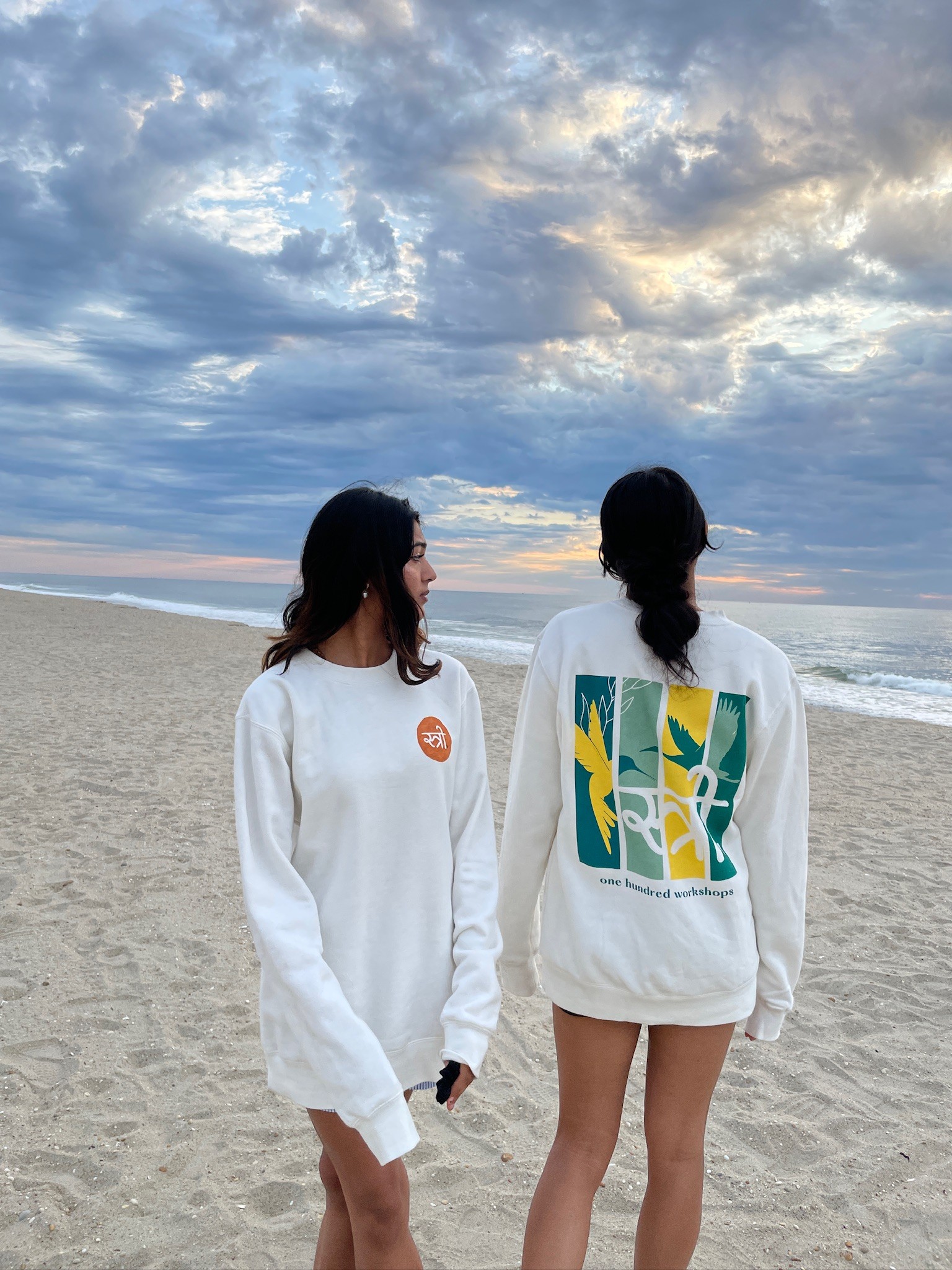
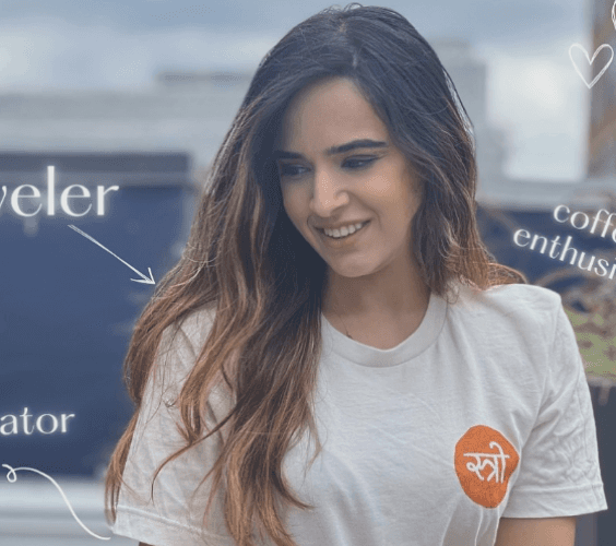
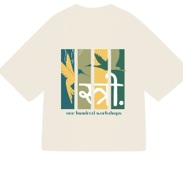
The patterns are a celebration of individuals, location, and tradition. So we simply aimed to echo our style ethos through all goods and merchandise we designed.
We also designed some cool merch!
*
Our aim was to guarantee that the online journey was just as crucial and even more enlightening. It encompassed all that was unique to our brand, including our blog.
Web
Interface

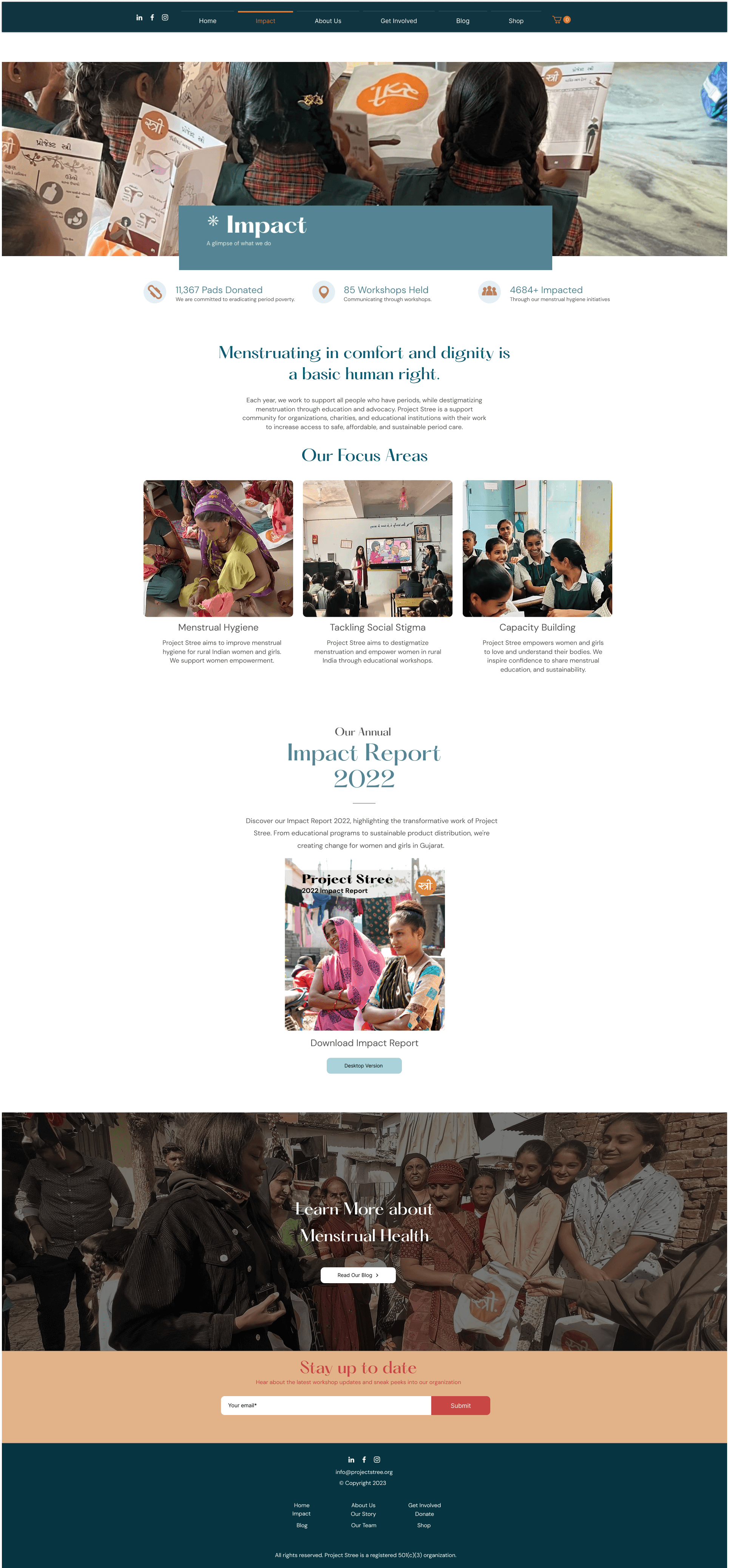
Home Page
Impact Page
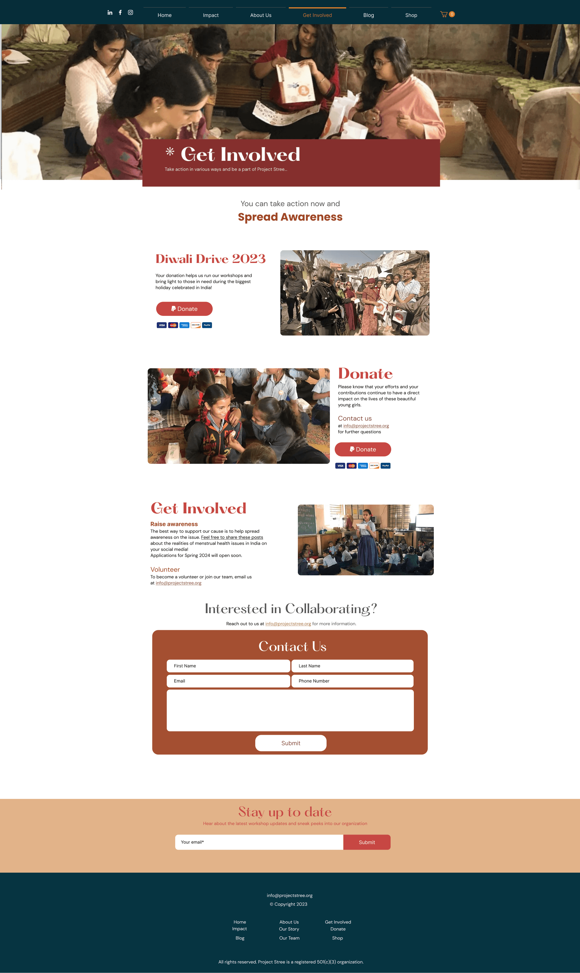
Get Involved Page
USER FRIENDLY
Icons & CTA's &
Navigation
We created distinct, practical call-to-action elements for the site, ensuring they meet WCAG accessibility guidelines. Our goal was to accommodate our diverse visitor demographic and advance our mission.

EASY NAVIGATION
Designing cards for
easy navigation
We ensured that all our data is organized hierarchically, enabling users to comprehend and interpret information more effectively. Also, we were considerate about the usage of accessible and universal typescripts.
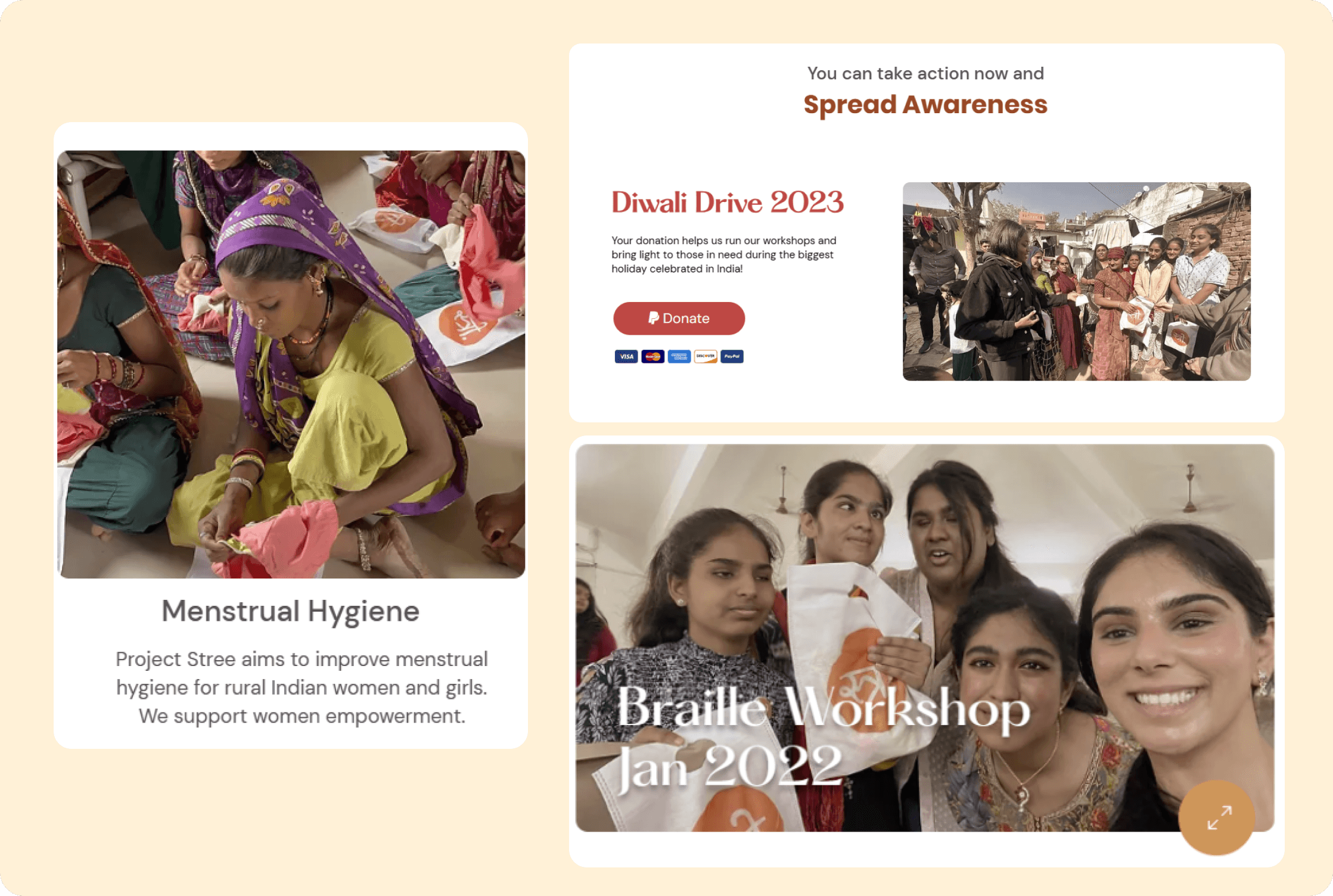
HOVER ANIMATIONS
Decluttering Information
We added subtle hover variations and animations to enhance site interactivity.
A mobile version was also created, omitting some desktop animations, to ensure clear information delivery since most customers first access the site via mobile.

The transformation was more than just visual—it was experiential.
After the launch, we analyzed key metrics from our WIX dashboard to measure the impact.
The Impact
Website Engagement Increased, in first 3 months
as a result of interactive storytelling, user-focused design, and intuitive navigation, leading to a stronger connection between visitors and the platform.
70%
Merchandise sales generated additional revenue
leveraging brand identity and ethical design, allowing the organization to fund more community programs sustainably.
Overall
Mobile bounce rate decreased
attributed to clearer CTAs, emotional storytelling, and an optimized donation flow, making contributions more intuitive and meaningful, reflecting a more accessible and user-friendly experience with faster load times and improved usability.
50 %
Working with Project Stree reinforced my belief in design as a catalyst for change.
Through thoughtful UX, branding & storytelling, I didn't just improve a digital presence
— I helped amplify voices that deserved to be heard.
KEY TAKEAWAYS
Emotion-Driven Design
Users connect with authentic stories, so we used real pictures, and rooted our design in culture.

Brand Consistency
Ensuring brand consistency across media while collaborating with designers with different styles was challenging. I learned to navigate diverse design languages while maintaining cohesion.
Inclusivity in Design
Ensuring accessibility and cultural relevance broadens reach and impact.
This project wasn't just about design—it was about empowerment, storytelling, and making a real impact.
I project close to my heart, where design became a voice for empowerment, education & change. :)