





Ornami's story starts with a breakup. We turned it into a brand: one brand book, a packaging line and a live online store.
Role
UX designer and project lead, as a master's student
Studio
Scout, Northeastern's student-led design studio
Client
Ornami, a natural bodycare line
Scope
Identity, packaging, e-commerce
Year
2022
Status
Live at ornami.com0
colours
0
typefaces
0
claim badges
0
packs
0
page types
0
breakpoints
THE IDEA
The voice shows up in the names
Song titles, fresh starts and clean slates. Even the labels carry the breakup story.
Colours
Adorn Me PurpleNo Scrubs BlueBadder Black
Products
Fresh StartLet That MangoNo Scrubs
On the pack
Know what goes on your skinPsst, scan me
LOGO




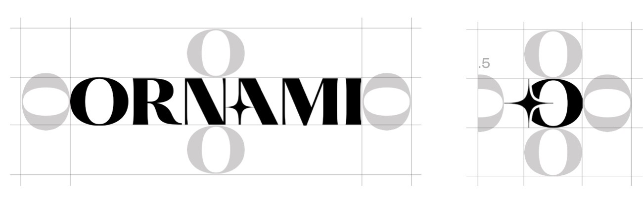
One O of space. The letter sets the clear zone, so it scales with the logo.

Six don'ts. Clear limits, so the mark holds up when other people use it.
Why this mark
Alternatives drawn for this case study, to show what the final logo had to beat. Only the final builds the star into the letters, so the sparkle can't drift away from the name.

Friendly

Editorial

Condensed

Stacked

Badge
Final
COLOUR
Adorn Me Purple
#372F81
Smokey Lavender
#7976B4
Better Baby Pink
#F4D6E7
No Scrubs Blue
#D3DEF9
Badder Black
#232323
Teal
#81A4B2

Purples carry white text.
Pink and blue only sit behind purple or black text.
Black body text goes on white, pink or blue.
TYPE
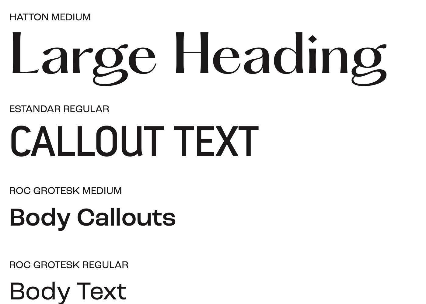
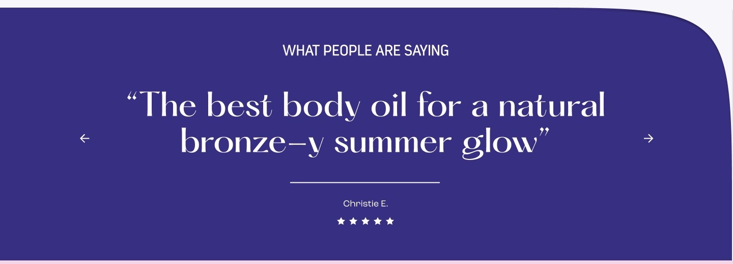
Hatton
The voice
Hero lines and quotes. High contrast, a little dramatic.
Estandar
The callout
Labels and short headers, set condensed.
Roc Grotesk
The work
Headings, body and interface text.
BRAND ELEMENTS
The star
Marks a corner. Sits on heroes, packs and sections that need a little sparkle.

The swoop
Replaces a corner, so one block flows into the next.
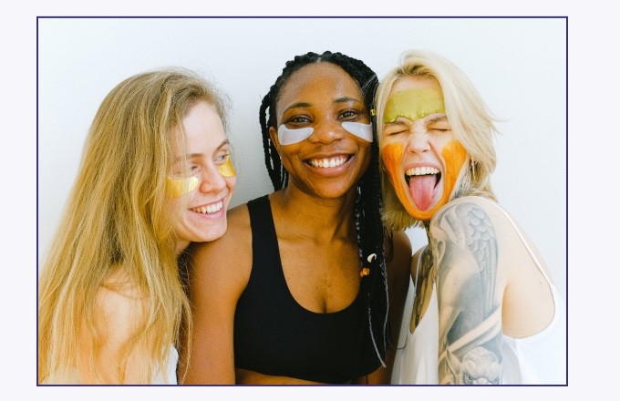
The box
A thin purple outline around photography. It ties every photo back to the brand.
Eight claims, one badge
Natural, vegan, non-toxic and so on. They sit on the product page, so proof reads as part of the design.



Gradients add the glow
They run from subdued to expressive, across packs, the site and social.




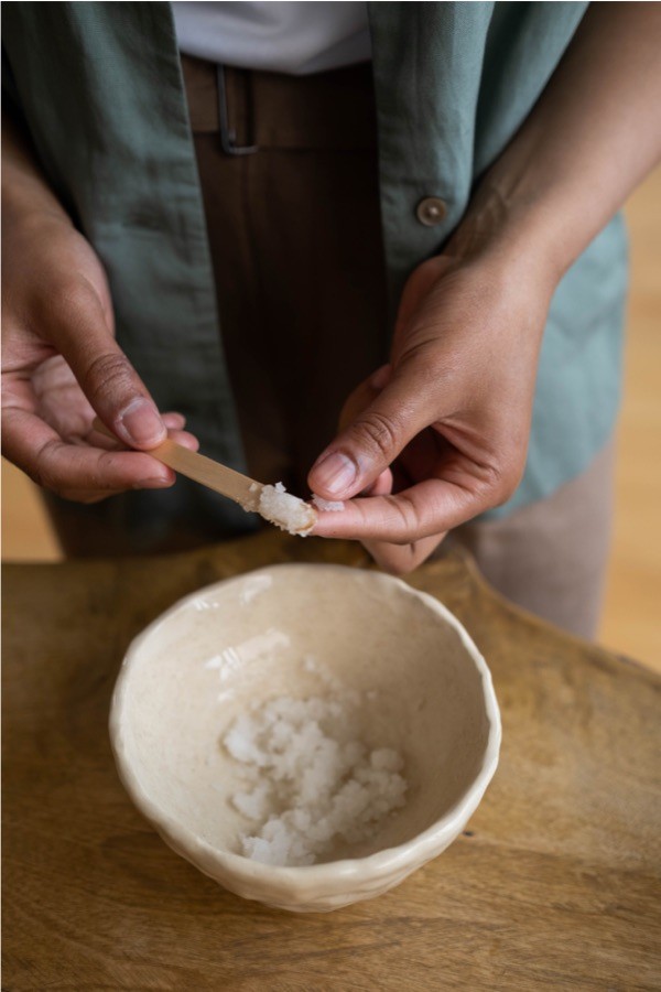
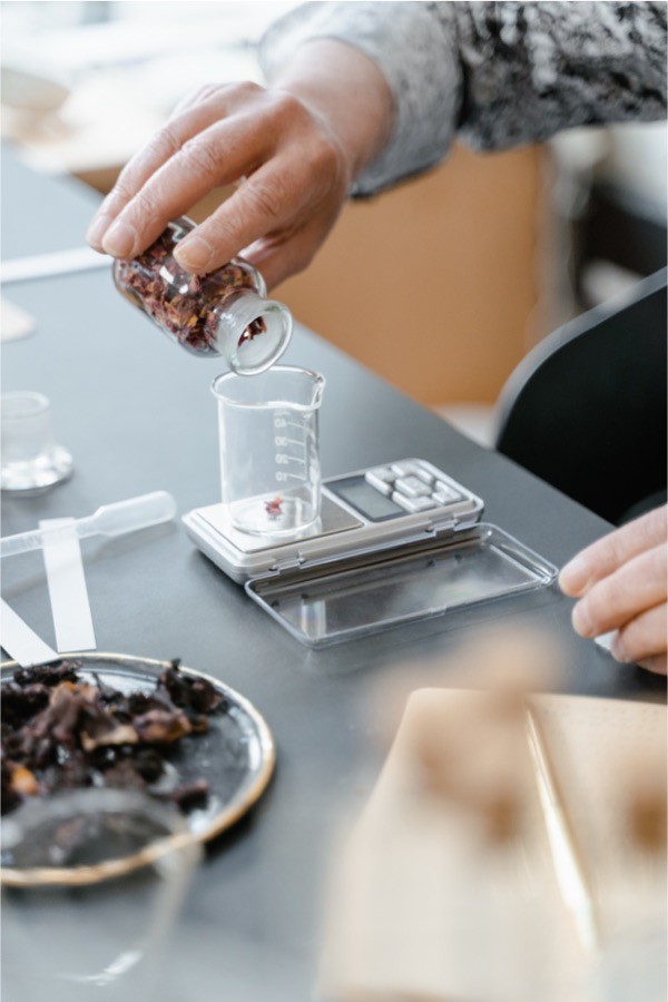
Photography aims higher than everyday
Aspirational, medium to high contrast, warm or cool, and diverse. Real skin, rituals and small indulgences.




PACKAGING
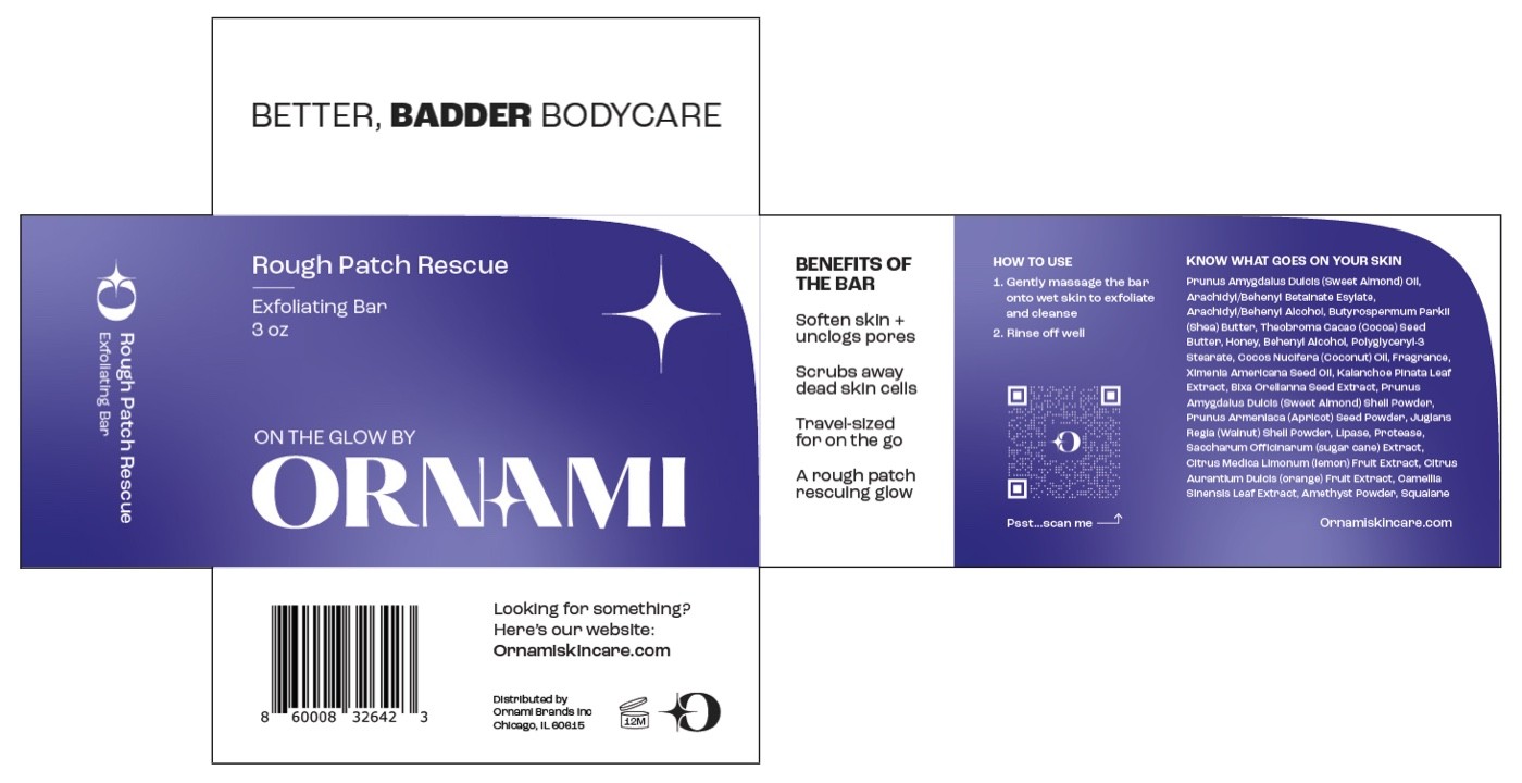

One template
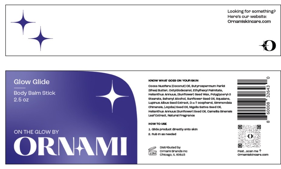
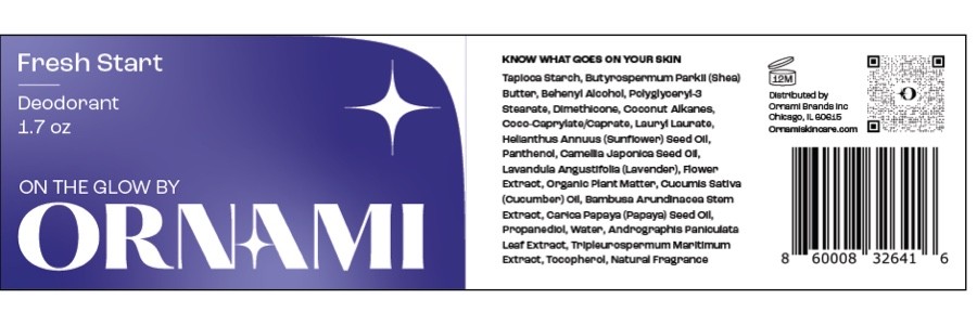
Swoop, gradient, star and wordmark hold still. Only the product name changes.
A star in silver
On the front, the star motif prints in metallic ink.
Honest on the back
“Know what goes on your skin” leads the ingredients, with a QR code alongside.
And then it shipped
The same band, wordmark and star, on real products you can find at ornami.com.

Fresh Start
Clean deodorant
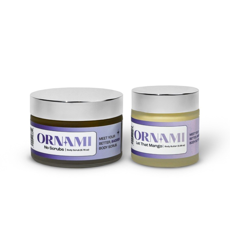
Bestie Combo
Scrub and butter set
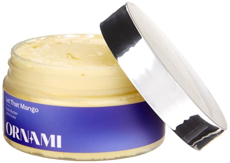
Let That Mango
Body butter
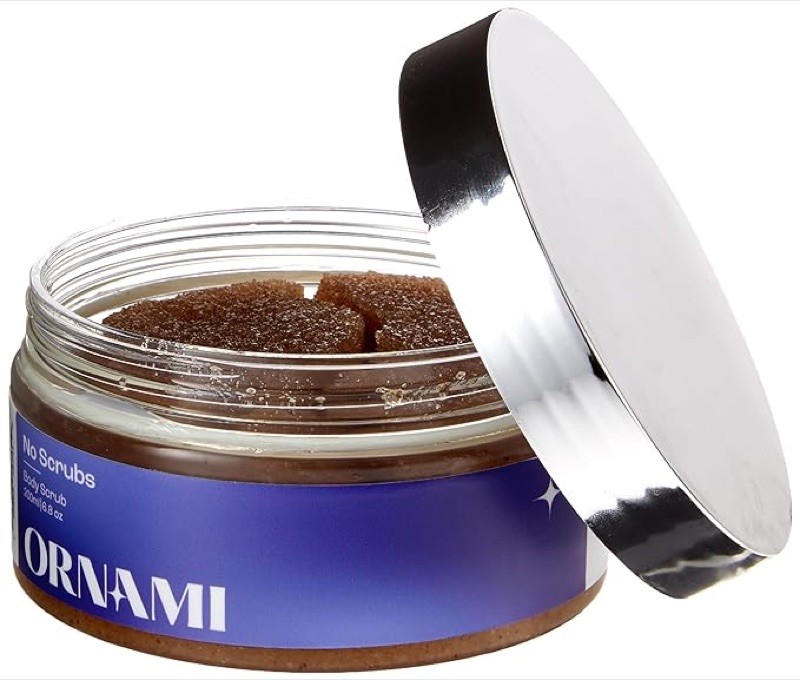
No Scrubs
Sugar scrub
E-COMMERCE

Hero, best sellers, press, reviews and the Glow Guide, all on the brand's swoops and boxes.
Visit ornami.comEvery page, three ways
Seven page types at three breakpoints. The swoops, boxes and star all reflow with the layout.
Desktop

Tablet

Mobile
WEB SYSTEM
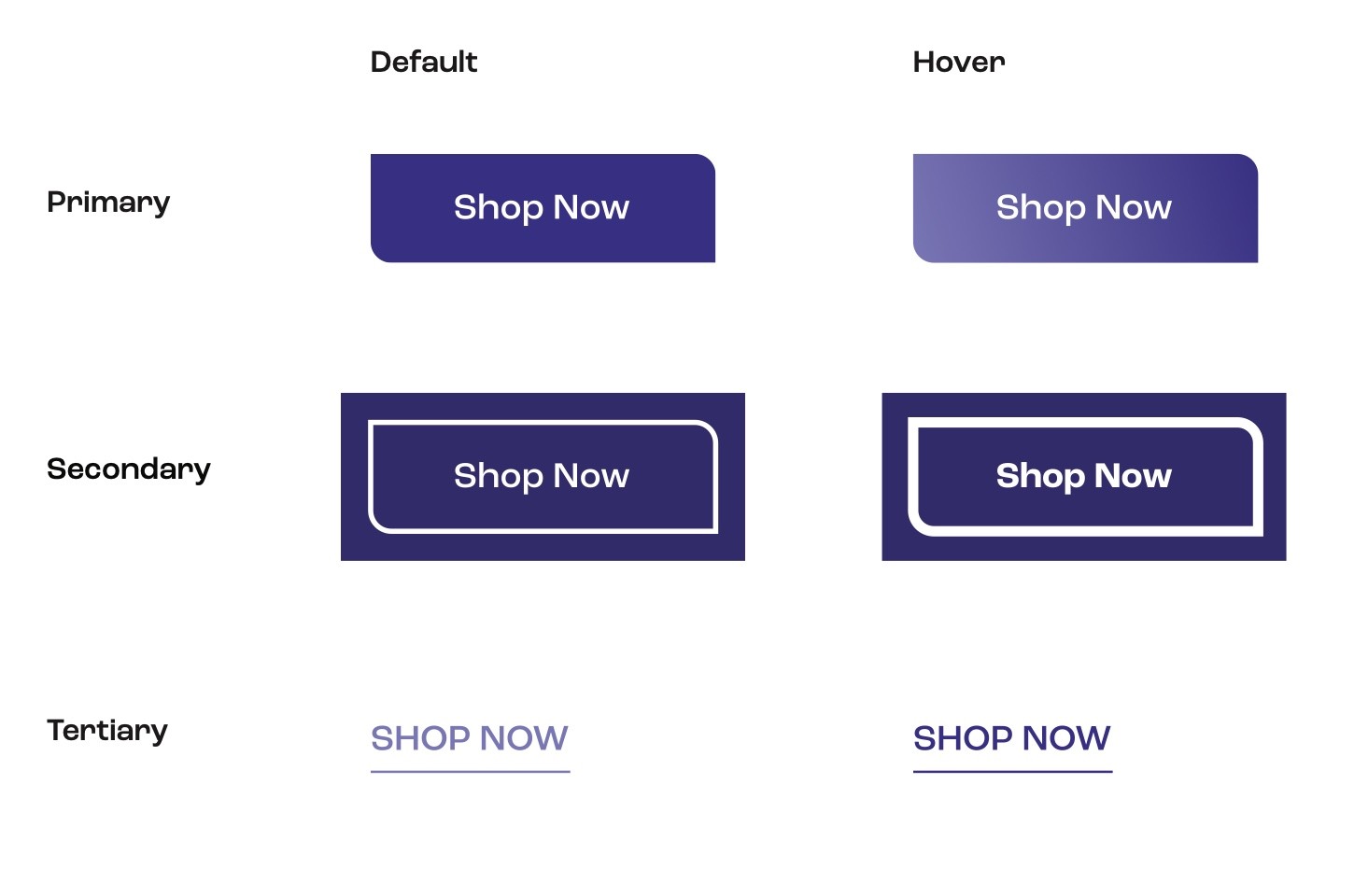
Buttons. Primary, secondary and tertiary, each with a hover state.

Inputs. Selects, steppers and radios, with disabled states.

Footers. The swoop again, specified in pixels at every breakpoint.
TAKEAWAYS
What I took from it as a student
A strong idea does half the design
Once the breakup story existed, the names, colours and copy all had somewhere to start.
Write the rules, not just the logo
The live site still follows the book: swoop, box, star, even the footer. The rules kept working after we handed them over.
Print has no undo
Dielines, ink specs and real ingredient lists meant the work had to survive a manufacturer, not just a browser.
Leading is mostly translating
As a master's student leading a real client project, my job was turning a founder's vision into decisions a team could act on.